Home · San Diego
A small universe.
I live in San Diego with my wife, my son, and a circle of friends who make up our little universe. My wife and I share so many things together: comedy, travel, art, people-watching, good food, and more.
Twenty+ years designing & shipping across product, graphic, web, motion & front-end development. Thirteen+ leading and building teams with humor and an entrepreneurial spirit.
“Joe was instrumental during DNN’s transition to a design-centered organization.”
“He is not a pretentious designer — when he designs he always aims to solve the ‘right problem.’”
“Joe is a fantastic partner for any senior marketing executive in helping create a compelling brand identity.”
Drop a line below and I'll get back to you within a couple of days.
Through a long career, I am still thriving with a creative mindset, my passion to explore, fix, learn and help lead teams with empathy. Every day brings another amazing challenge and opportunities to put my creative and analytical mindset to work. Let's explore together.
Joe Richardson · Lead Product Designer · 13+ years leading & managing · San Diego, CAHome · San Diego
I live in San Diego with my wife, my son, and a circle of friends who make up our little universe. My wife and I share so many things together: comedy, travel, art, people-watching, good food, and more.
On the field
I've enjoyed coaching and watching my son's baseball teams. The bigger reward has been watching him grow into a passionate and caring human with a huge drive.
Three years on a kibbutz
I was raised in Israel for three years on a kibbutz, and I've travelled widely since. Different cultures have different ways. The introspection underneath is what I keep coming back to: the universal traits we all share. That observation shapes how I think about design.
Eighteen holes
Golf is how I step away from pressure. Most of my best ideas arrive somewhere mid-round, when I'm meditating through the next shot. Each day is a new adventure, and I tackle it that way, hoping for inspiring outcomes whether for family, friends, or work.
San Diego, hybrid or remote. Looking for a team where design has a seat at the table and AI is part of the work.
Twenty+ years shaping graphic, web, video, B2C, B2B enterprise software at many companies including Marketo, ServiceNow, and Egnyte, with $3.3B in combined exits and 20k+ customers on shipped AI products for Egnyte.
Lead and grow product design teams across enterprise SaaS. Hands-on with hiring loops, calibration, weekly 1:1s, growth conversations, and performance reviews. The slow craft of building a team that actually ships.
Career-ladder conversations, real growth plans, weekly 1:1s. The win, for me, is when someone leaves my team for a bigger role somewhere else.
Own the loop end-to-end: rubric, recruiter brief, portfolio review, behavioral panel, calibration. First-90-day plans tailored to each new hire's level and adjacent partners.
Headcount and roadmap are the same conversation. I plan capacity quarterly, surface trade-offs early, and protect makers from churn so the work stays focused.
PM and engineering treat me like a peer, not a service desk. I'm in roadmap planning, exec reviews, and architecture discussions before specs land.
Present to VPs and the C-suite often. Lead with the user problem, not the design. Keep the deck shorter than they expect.
Read the same signals leadership reads: ARR, retention, customer growth, gross margin. Design ROI is a conversation I walk into with numbers.
Sprint cadence, design review cycles, decision logs, definition-of-done. Light enough to feel agile, heavy enough that nothing slips.
Prompt-to-output patterns, refusal contracts, source attribution, edit-after-send, agent loops. Currently leading AI surface design at Egnyte for Copilot, Agents, and Smart Apps.
Component libraries, design tokens, governance, contribution models. Co-led the Egnyte platform redesign across Web, Mobile, and Desktop.
Interview design, synthesis, journey mapping, usability testing. Plus AI-assisted secondary research with Claude and Perplexity to compress weeks of public-narrative reading into days.
Twenty years in this register. Egnyte (cloud collaboration), ServiceNow (workflows), Marketo (marketing automation), DNN (CMS). Enterprise B2B is the muscle.
Steady (the post-diagnosis patient navigator) is a B2C surface. Tone, trust, and refusal patterns are the muscles I use here.
Translate design choices into business outcomes — revenue, retention, exit-readiness. Three of the companies I helped shape sold for a combined $3.3B (DNN, Marketo, Egnyte).
First-run experience, empty states, progressive disclosure, in-product education. The first three minutes of a product matter more than the next three months.
End-to-end journey across product, support, and human moments. ServiceNow (HR Service Delivery, ITOM) was where I learned the human/system handoffs are the product.
Brand identity, marketing surfaces, editorial illustration, custom type. Two decades of sharpening the visual register.
Marketing sites, product surfaces, design-engineered output. The freelance Eyesoar Media years lived in this register.
UI strings, error tone, AI refusal language, microcopy. "Nice work, invoice sent" beats "Invoice #0012 transmitted successfully."
Pair design hypotheses with measurement — product instrumentation, funnel analysis, A/B-aware iteration. Build for what shipped, not what demoed.
Real-user archetypes drawn from interview synthesis, not made up. Caregiver-vs-patient dyads on Steady; freelancer-vs-buyer asymmetry on Sole.
After Effects, Premiere, Lottie, motion design for product. Shipped product motion at multiple companies and edited my own showreel.
Along my design journey I've been lucky enough to help multiple businesses get acquired, including DNN Software, Marketo & Egnyte.
Egnyte — Helped create managerial guidelines and more fluid design processes between Engineering, PM, and design groups, while presenting, pushing, and executing on visionary concepts. Outright purchase ($1.5B) by GI Partners and TA Associates.
Marketo — Co-led a complete visual and UX language redesign that gave Marketo a fresh, modern feel across its SaaS offering. Outright purchase ($1.8B) by Vista Partners.
Twenty years means a lot of rooms. The themes that repeat are the ones I lean on.
Egnyte · ServiceNow · Marketo · Get Satisfaction
The room where reliability is the brand.
Egnyte Copilot, Agents, Smart Apps · Steady · Sole
Where trust is built one micro-interaction at a time.
Egnyte · Marketo · ServiceNow component work
Tokens, components, and the governance that keeps them honest.
ServiceNow ITOM · HR Service Delivery
Dense flows where ambiguity costs the team time.
Marketo · Get Satisfaction
Tooling for the people who actually run the funnel.
Sole · Self-employed 2004–2010
Where the user is also the buyer, the bookkeeper, and the support team.
If any of this matches with what you're hiring for, I'd love to hear about it.
Staff+ design or design leadership. AI-product design preferred. Equal parts strategy and craft, with the seat at the planning table that goes with that.
Engineering and product partners who treat the user problem as the brief. A culture where design is consulted before the spec, not asked to polish what's already shipped.
San Diego-based. Hybrid or remote. Open to bay-area travel and the right offsite cadence. Looking for a long nexrt chapter, not a short one.
San Diego, hybrid or remote. Looking for a team where design has a seat at the table and AI is part of the work.
An AI-driven application for the freelancer
AI-native freelance OS.
Six tools, one job.
10 hrs back. Trustworthy AI.
Founder. End-to-end.
8 tools, 12 stages, 8 tones.
Five new AI patterns.
Sole design system & Next.js.
Beta Q3 2026.
Talked to 23 freelancers about AI in the tools they already use. The common worry: I don't want to be locked into something the system thinks I want.
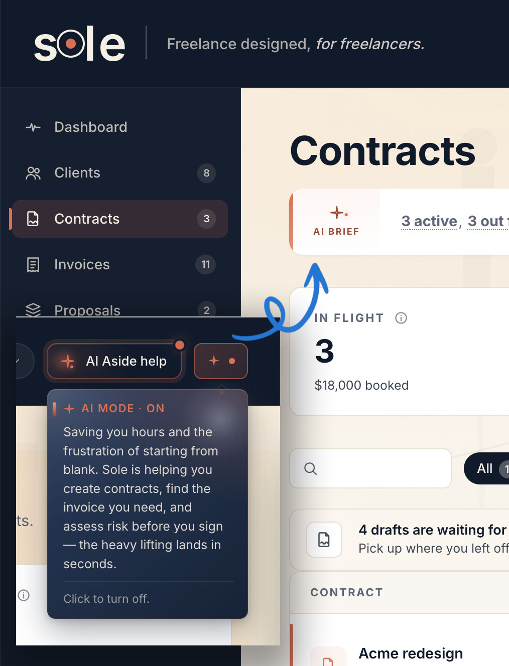
Most products bury the off switch or pretend AI is just on. No way out.
AI Mode is one pill in the top nav. On by default. Off in one tap. The toggle teaches what's running and what would stop. Trust by transparency.
On by default for the productivity gain. Off in one tap for anyone who doesn't want it. The trust is informed, not implicit.
Studied a dozen in-product AI assistants. Linear, Notion, Intercom Fin, Gmail's Help Me Write. Two failure modes everywhere: chat boxes too generic to answer real questions, pop-ups that interrupt the work.
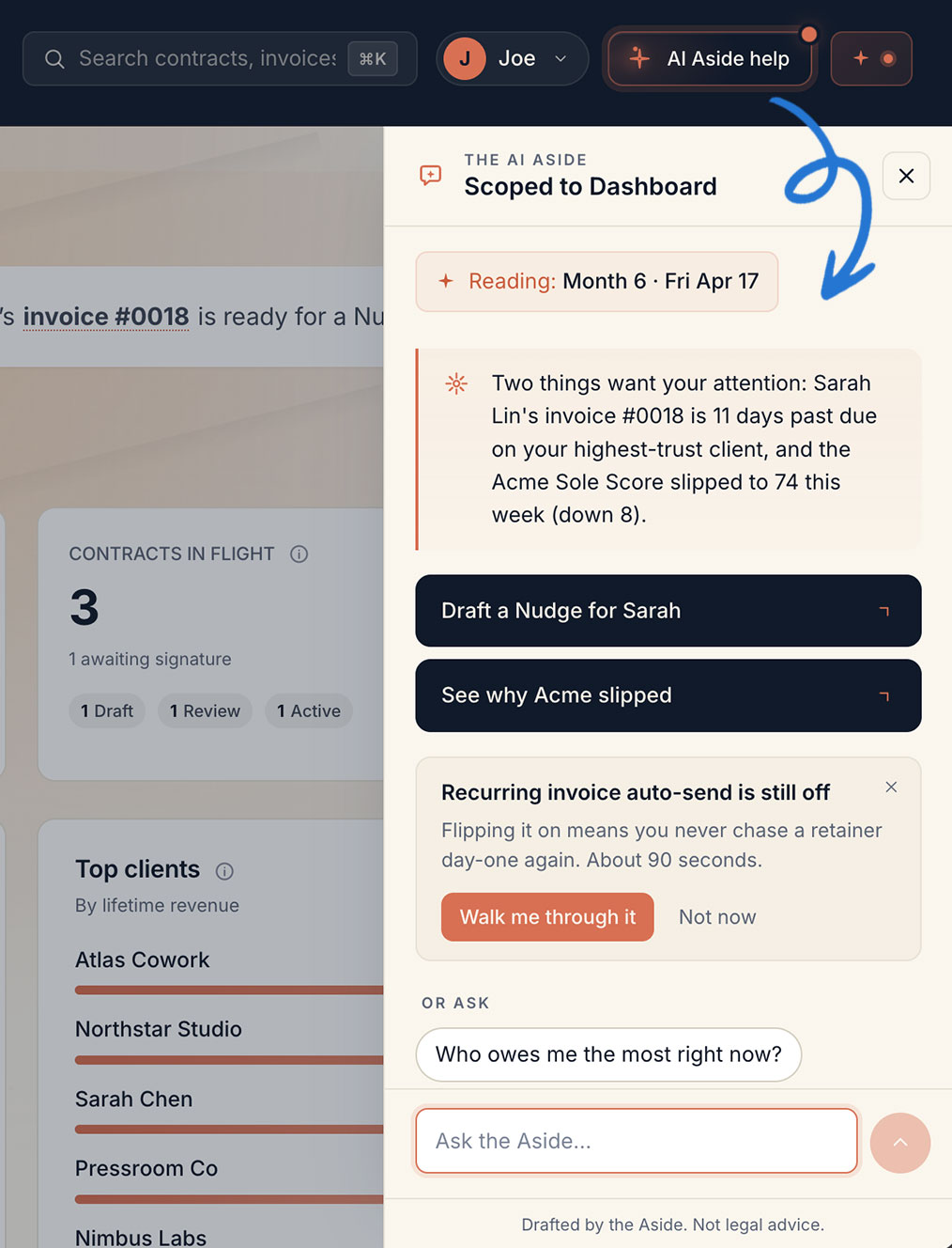
Generic answers waste a click. Interruptions break the flow. Either way, the freelancer stops working.
AI Aside opens scoped to the current page. Next-action chips read the live data: "Draft a Nudge for Sarah." "See why Acme slipped." A side panel, not a modal. The Aside earns the next click by being right.
Reads the current page. Hints the next move. Earns the next click by being right.
Watched 11 freelancers create a contract from scratch. The hardest part was always the blank page. Templates help, but still ask for thirty fields.
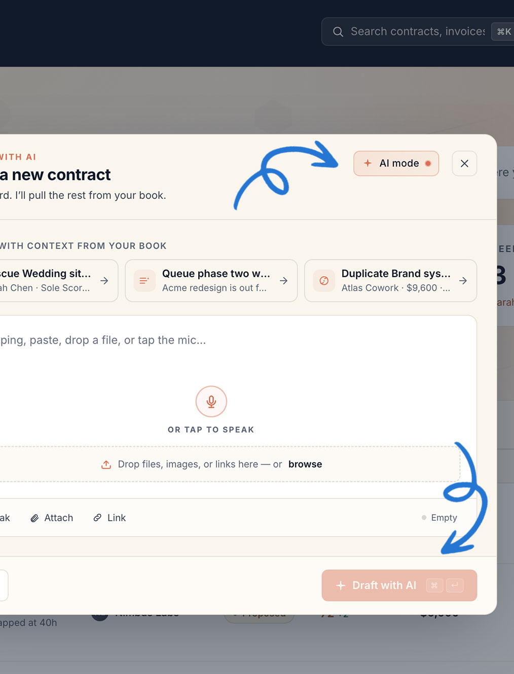
Most freelancers copy the last contract and find-replace. Fast, and slightly dangerous.
Contextual AI starts from a clue. A customer's website, a project name, a voice memo. The model drafts from the freelancer's own past work. The blank page is gone. The freelancer's voice is intact.
Give a clue. A website, a project name, a voice memo. Sole drafts from the freelancer's own past work.
Strong CRM bones and a templates-first dashboard. Reads like a real freelance OS for someone who already has a system in their head.
No AI workflow inside. Every nudge, follow-up, and reminder is still hand-rolled by the freelancer.
Sole keeps the templates-first DNA but replaces every manual step with an AI hand. Same comfort, half the work.
All-in-one freelance ops in a single tool. Contracts, invoices, time, expenses, taxes — Bonsai owns the full stack.
Form-first, AI-last. The user fills 14 fields by hand before AI ever surfaces a suggestion.
Sole flips the order. AI fills the fields from a brief; the user reviews and signs. Same data, half the typing.
Pipeline thinking made visual. The kanban metaphor makes deal stages and project flow legible at a glance.
AI feels bolted on. Drop-down menu items rather than woven into the work.
Sole keeps the pipeline clarity but threads AI through every stage transition. AI as the spine, not a side feature.
Industry-standard accounting. Bulletproof tax-time exports, reconciliation, and audit trails the IRS won't argue with.
Built for accountants, not makers. Freelancers hit a wall of jargon they did not sign up for.
Sole shows the same numbers in freelancer language. "What's coming this month" instead of "AR aging by 30 days."
One headline number owns the screen. Every Stripe dashboard answers the most important question first.
B2B fintech polish, optimized for engineering teams. Solo creators feel like guests at someone else's party.
Sole borrows Stripe's single-number-first rule. Sole Score takes MRR's slot as the calibrated headline.
Card anatomy. Every Linear ticket reads as one clean verdict — title, decision, next action.
Built for product teams sprinting. Freelancers don't run sprints; they run weeks.
Sole adopts Linear's card grammar for contracts and proposals. One card, one verdict, one next step.
AI voice that doesn't perform. Speaks plainly, asks clarifying questions, knows when to stop.
Generalist by design. Doesn't know your books, your clients, or your terms.
Sole's voice is borrowed wholesale from Claude — partner-tone, not tool-tone — but trained on the freelancer's actual business.
Visual restraint. Mono type, hairline borders, no decorative chrome. Trust comes from clarity.
Cold by design. Built for engineers who want their tool to disappear.
Sole borrows the typographic restraint but warms it up. Mono for data, serif for empathy.
Flow study outcomes: Protect · Define · Get PaidTop three AI workflows that take admin off the freelancer's plate.
First contact. A lead lands in the inbox, DMs, or via referral. The freelancer needs to qualify, respond, and route.
Most freelancers wing it. Leads pile up across channels with no scoring and no follow-up cadence.
AI captures every lead from email and DMs into one inbox. Auto-tags by source and intent. No lead falls through.
Quick gut-check on whether to take a project. The freelancer weighs scope, budget, and red flags in five minutes — go or no-go.
Bad-fit projects cost double. The freelancer eats the loss and the opportunity cost of saying no to better work.
A red-flag scorer reads the prospect's brief, website, and prior emails. Surfaces five risk signals with a 0–100 fit score. Freelancer still decides, but with data.
Send a proposal. Brief, scope, timeline, fee. The pitch that wins or loses the work.
Win rates hover at 35–45%. Most proposals are too long, too generic, or arrive too late.
AI drafts proposals from the brief in 60 seconds. Three lengths, ready to send. Faster reply, higher close rate.
Contract signing. Both sides agree on scope, fee, deposit, and terms before work starts.
Contracts get written from scratch each time. Missed clauses cost the freelancer thousands later.
Verdict Card — a one-page contract with smart defaults: fee, deposit, kill-fee, IP, late terms. Sign in two minutes.
First day with a new client. Set expectations, share access, kick off the work.
Freelancers handcraft welcome emails every time. Tone, format, and rituals drift project-to-project.
Welcome kit auto-generates: client one-pager, calendar invite, kickoff agenda. One signature, one ritual, every time.
Translate the contract into a working scope. What's in, what's out, who decides.
Vague SOWs cause scope creep. The freelancer eats hours that were never priced in.
AI writes the SOW from the contract and names exclusions explicitly, so scope creep gets caught at the door. Out is out.
Doing the work. Weekly updates flow to the client to keep trust warm.
Updates are easy to skip. Freelancers fall silent and clients invent worst-case stories.
Auto-status nudges. Every Friday, AI drafts a three-line update from this week's work. Trust kept, no extra steps.
Client feedback comes in. Revisions get scoped, completed, and tracked against the contract.
Revisions sprawl. Freelancers lose track of round count and end up giving away free work.
Round tracker counts revisions against the SOW and flags when scope is exceeded. Free rounds end on time.
Client formally approves the work. Triggers the final invoice and project closure.
Approvals get stuck in email. Final payment delays for weeks waiting on a "looks good."
Approval doc generates from the deliverable, single click for the client to sign. Approval to invoice in one tap.
Bill the client. Send the invoice, follow up, get paid on time (or close to it).
Late invoices and silence. Freelancers hate chasing money, so it sits.
The Nudge. AI sends the invoice and three increasingly firm follow-ups, all in the freelancer's voice. Money lands without the awkwardness.
Wrap-up. Archive the work, ask for a testimonial, request a referral.
Most freelancers skip this entirely. Hot referrals go cold within 30 days.
Auto-generates the case study, testimonial request, and referral ask within a week of payment. Hot moments stay hot.
Stay in touch. Ninety days post-project, check in to surface the next opportunity.
Freelancers ghost their best clients. Repeat work that should have come back doesn't.
Sole pings the freelancer on day 90 with a draft check-in based on the past project. Repeat work, on autopilot.
Mapped the full freelance journey and pared it down to the most helpful 12 stages, then focused on where AI will save the most headaches, cost, and time. This became a map for Phase 1.
Casual, apologetic, conflict-avoidant. Reads like a text from a college roommate.
Lands as a non-event. Client skips it, payment slips further. "Friendly reminder" reads as wallpaper.
Sole's job is to get the freelancer paid, not to apologize for asking. Soft tone enables late-payer behavior.
All-caps demand. Debt-collector cadence.
Burns the relationship. Even if it gets one payment, the client doesn't come back for the next project.
Sole is a partner, not a lawyer. Threats are short-term wins, long-term losses.
Direct, warm, assumes good faith. Asks instead of demands.
Gives the client a graceful out without making the freelancer a doormat. 67% reply rate vs. 23% for the friendly tone.
Every nudge, every follow-up, every reminder Sole sends. The default voice.
Lawyer-speak. Triggers defensiveness instantly.
Client treats the message as the start of a legal fight. Often goes silent or escalates.
Sole is built on trust first. Legal language is the last resort, not the opening move.
Apologetic for asking. Hands the client an indefinite extension.
Worse than the friendly tone. Actively encourages the client to push the invoice down their list.
Sole's voice never apologizes for the freelancer's right to be paid.
Smart friend reviewing your contract. Specific, protective, action-oriented.
Names the issue, frames it as helpful, tees up the next step. No shame, no jargon.
Contract clauses, scope changes, IP and indemnity flags, kill-fees.
Calm accountant. Specific number, specific reason, specific action.
Replaces the dread of taxes and cash flow with a single-line nudge that's easy to act on.
Tax setasides, runway, cash flow, profitability checks.
Pattern-spotter. Brings observations, not conclusions.
Surfaces signal without taking the decision out of the freelancer's hands.
Prospect qualification, red-flag scoring, deal-fit summaries.
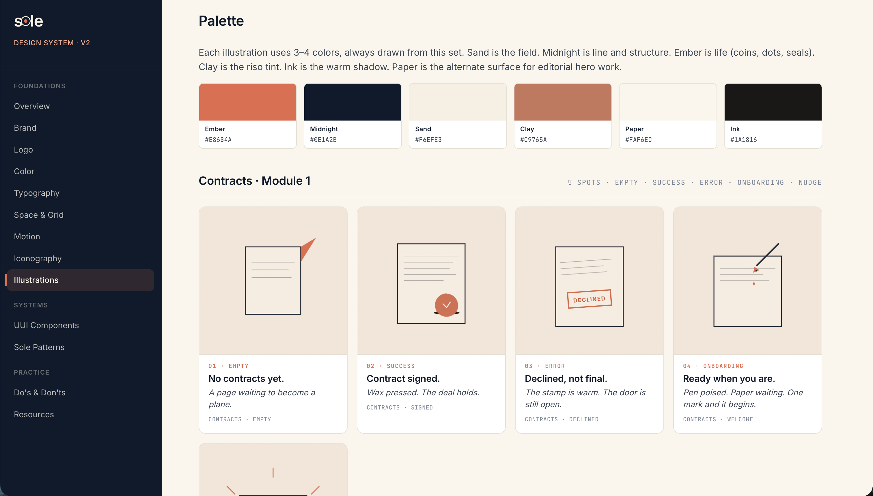
Sole is the operating system for independent workers. This is the living library that every screen, email, export, and nudge is built from.
Custom created illustrations give modern life and animation delight for end users with a beautiful color palette.
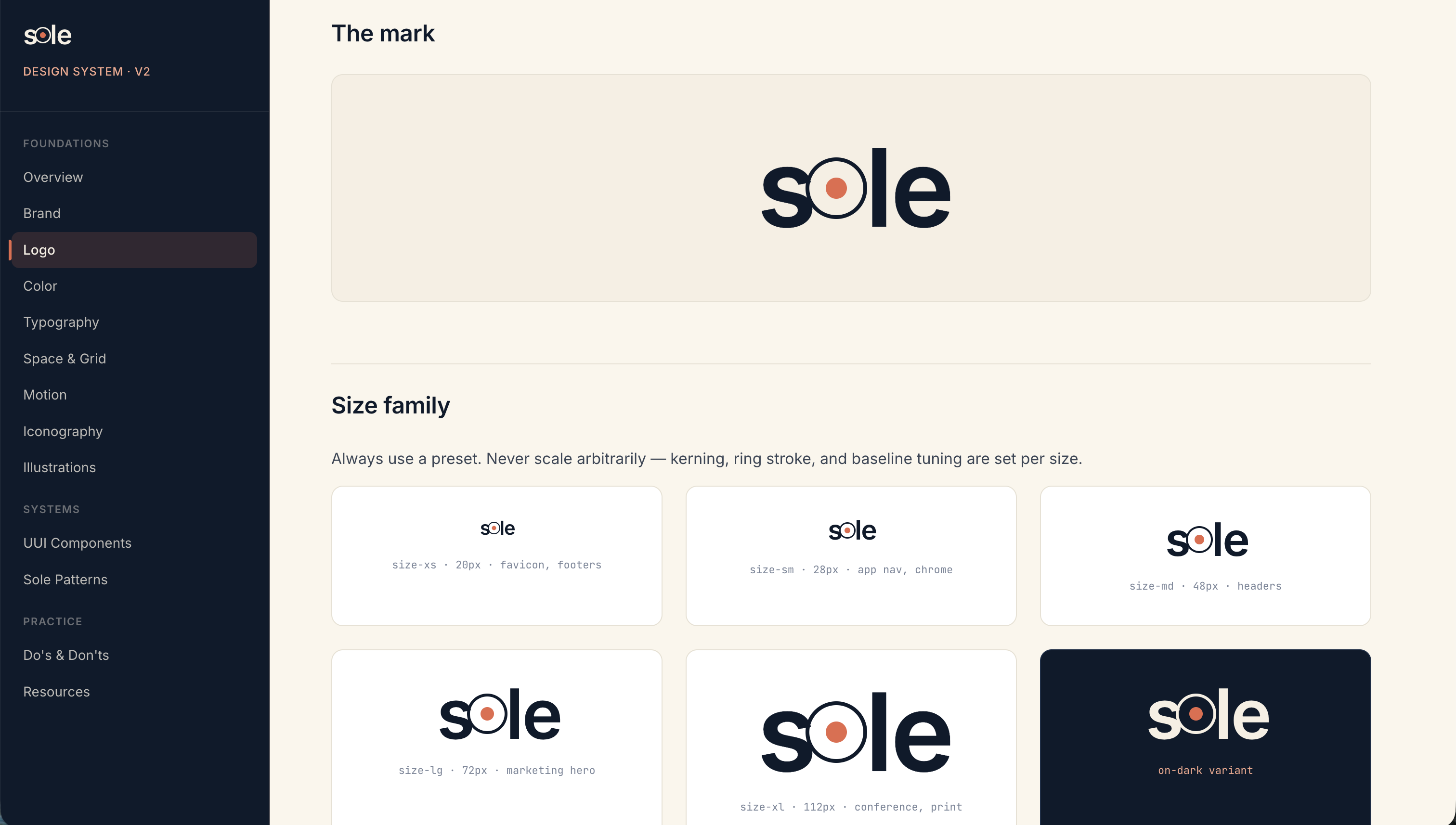
Multiple logo variants for almost any web, print or video project and a logo mark with originality and animated delight.
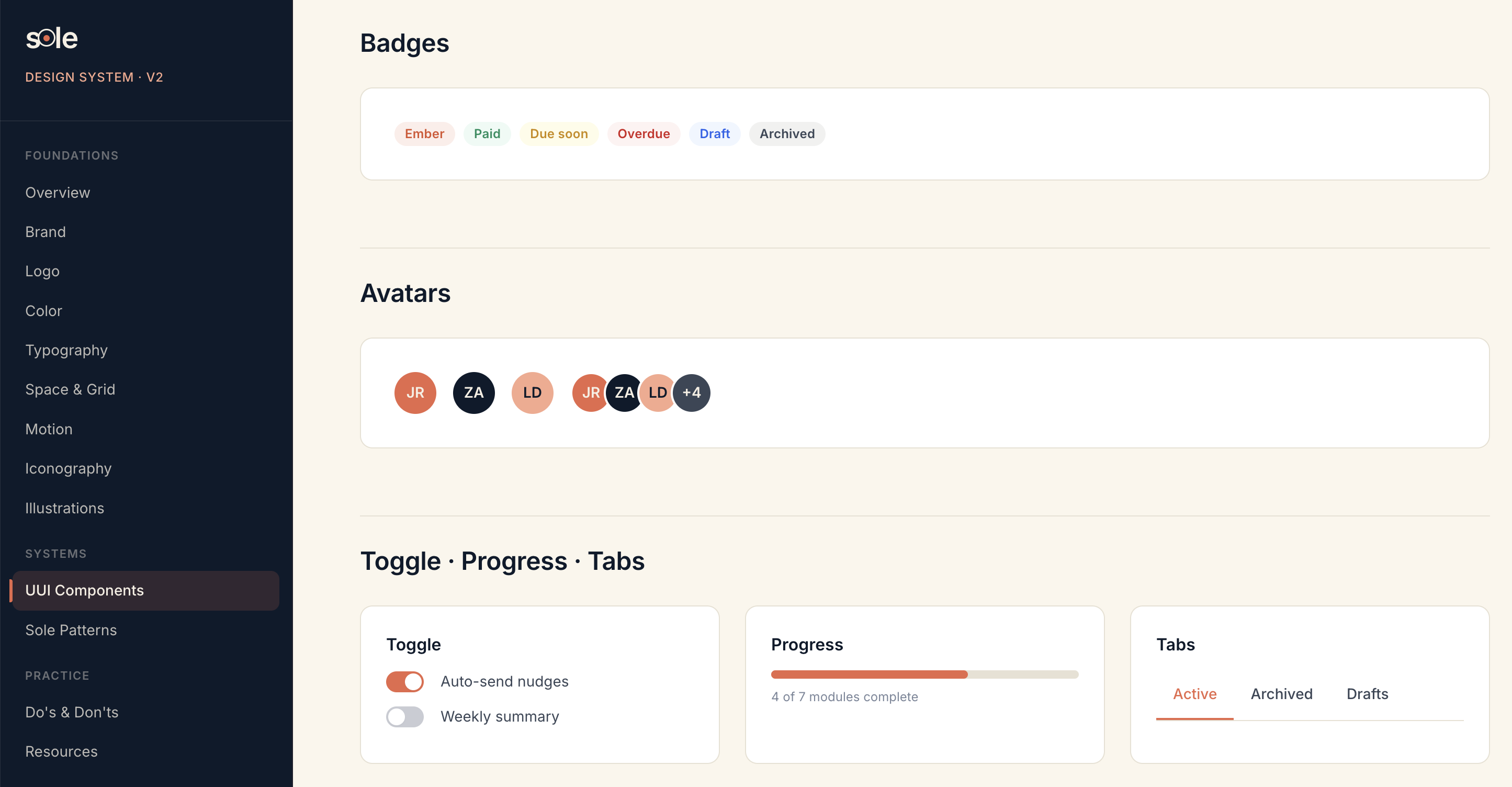
Badges, avatars, toggles, progress bars, and more. The Sole design kit is used as a basis for every Sole flow & crosses over to support marketing.
Marketing the brand: one voice, every surface. Hero landing page, social campaigns, and partner-ready collateral, all cut from the same Sole identity.
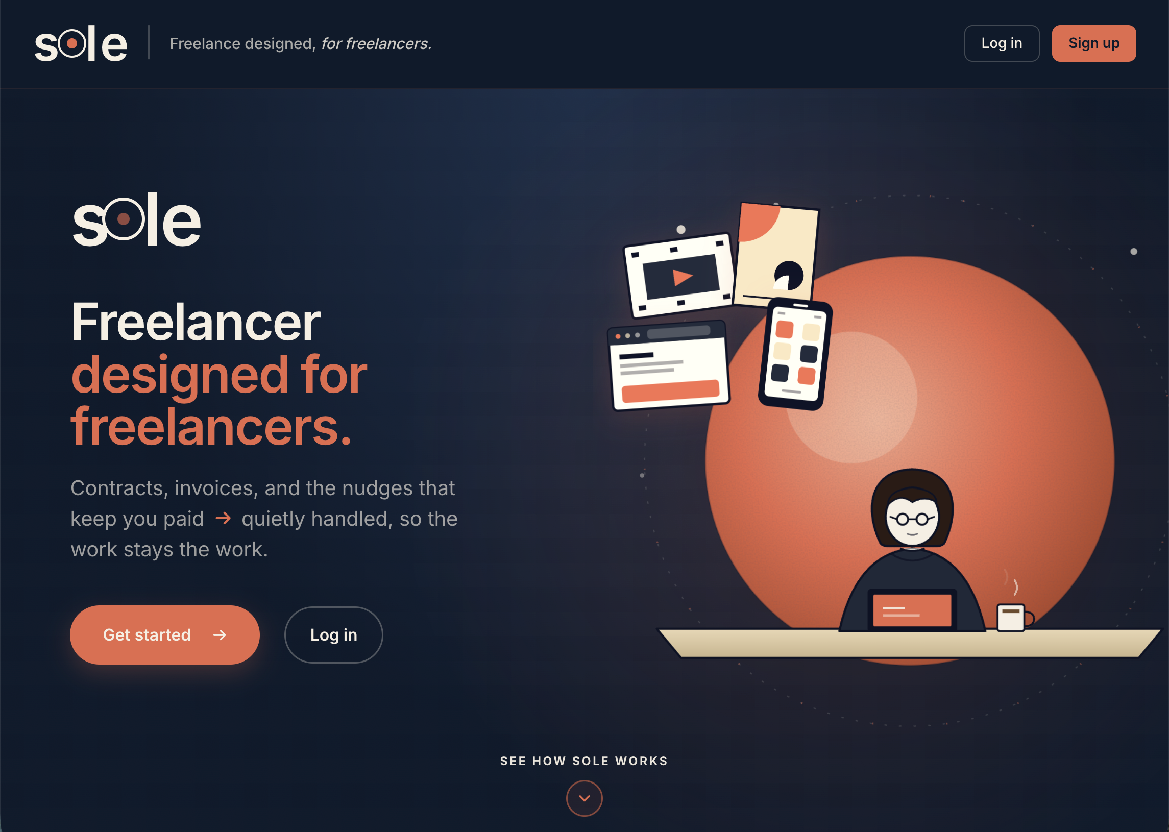
Studied a dozen freelance-OS landing pages (HoneyBook, Bonsai, Dubsado, Fiverr Workspace). Most lead with feature lists or generic run-your-business copy. Sole's hero claims the freelancer's identity head-on: Freelancer designed for freelancers.
The ember orb and the surrounding floating UI fragments (browser, document, mobile) give the page the warmth of a workspace and the breadth of a platform, without overcommitting to a single product screenshot. One primary CTA, one quiet secondary; the chevron at the bottom invites a scroll without forcing it.
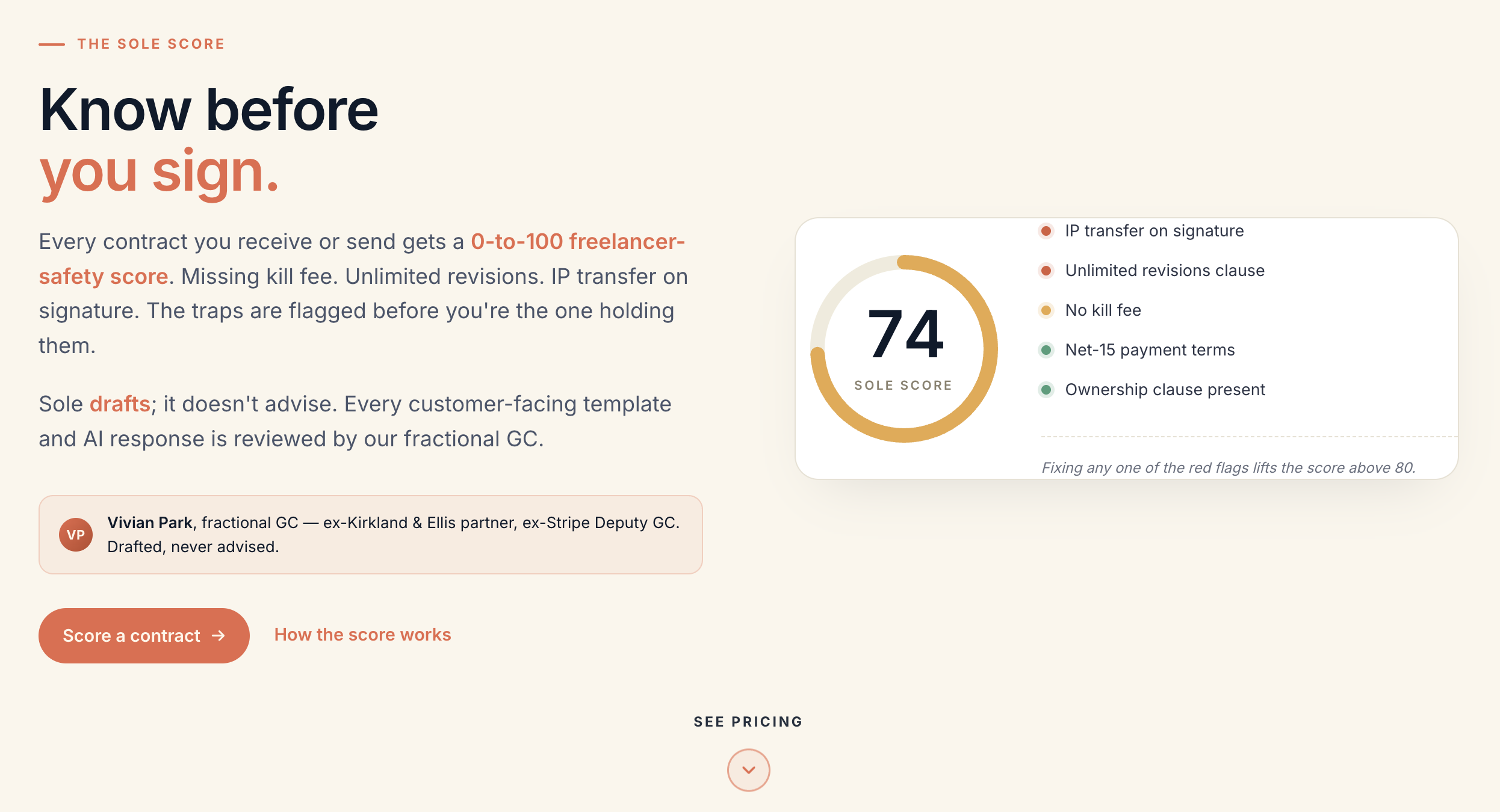
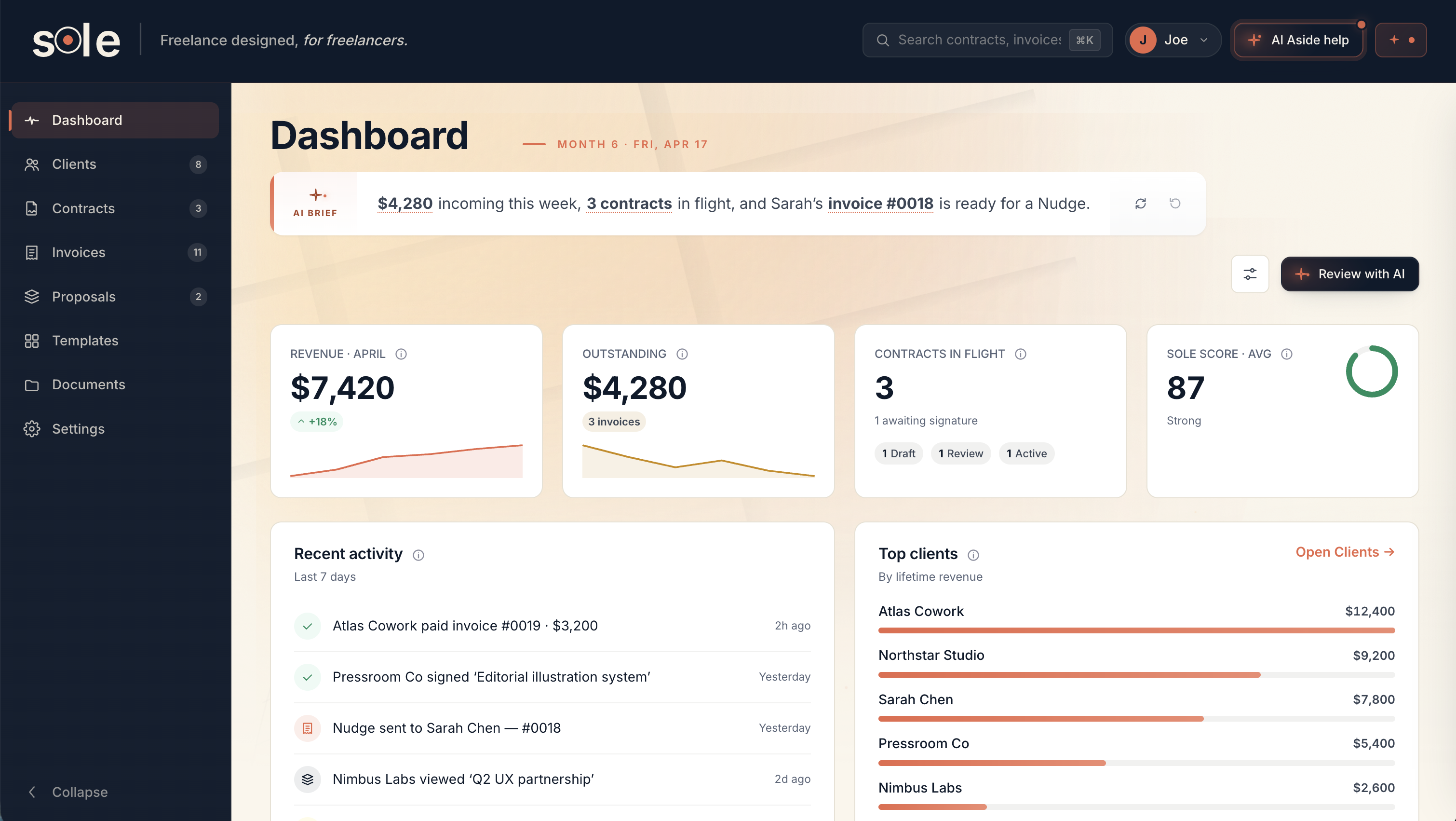
Looked at the contract-review tools freelancers actually use (Ironclad, LegalGPS, plain-text Google Docs reviewed by a friend). Most are too lawyerly to scan, or too generic to trust on a real deal. Freelancers asked for one thing: a number.
Sole borrows the credit-score mental model (universally understood, scannable in a second) and applies it to contract risk. The 0-to-100 score is the headline; the named red flags underneath answer why; the fractional GC review stamp earns the trust without turning Sole into a legal product.
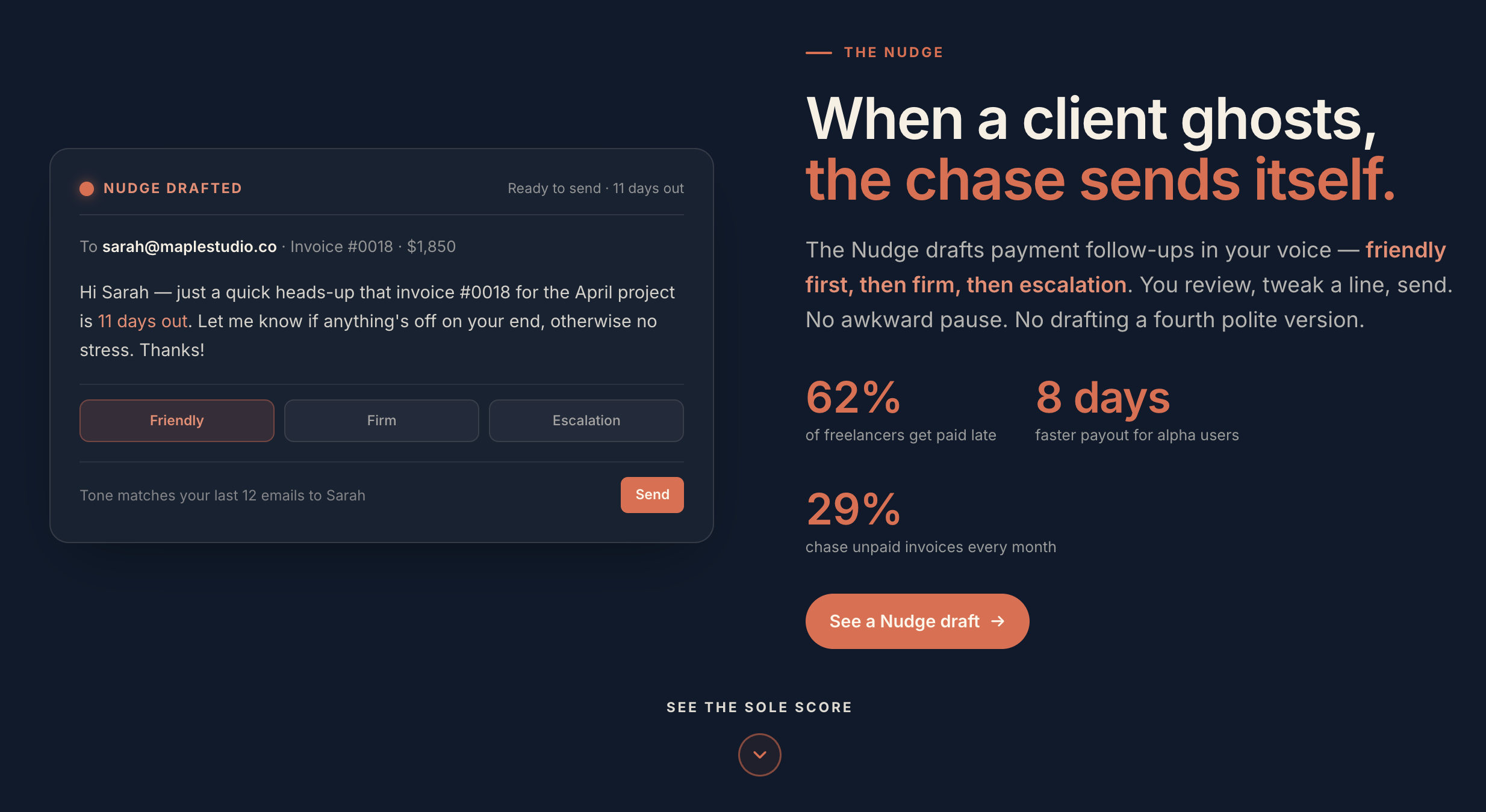
Interviewed 18 solo freelancers about late payments. 62% get paid late. The chase is the most emotionally taxing task in the lifecycle. People avoid it entirely (and stay broke) or fire off aggressive demands (and burn the relationship for the next project).
The Nudge writes the message instead of asking the freelancer to. Three drafts staged friendly, firm, escalation; tone-matched to the freelancer's last 12 emails to that client so the message reads native. The freelancer reviews and sends in one tap. The relationship survives, the invoice gets paid, and nobody had to draft a fourth polite version at 11pm.
I'd love to hear about your next project, your company, and the mission behind it.
Egnyte's first reusable dashboard, designed as the platform pilot.
Governance dashboard, built to scale.
Fragmented widgets, no shared system.
Revenue, engagement, platform reuse.
Lead designer, co-design partner.
Admin interviews + Pendo audit.
Modular widgets, one grid.
Specs, components, 95% vetted.
Every Egnyte dashboard.
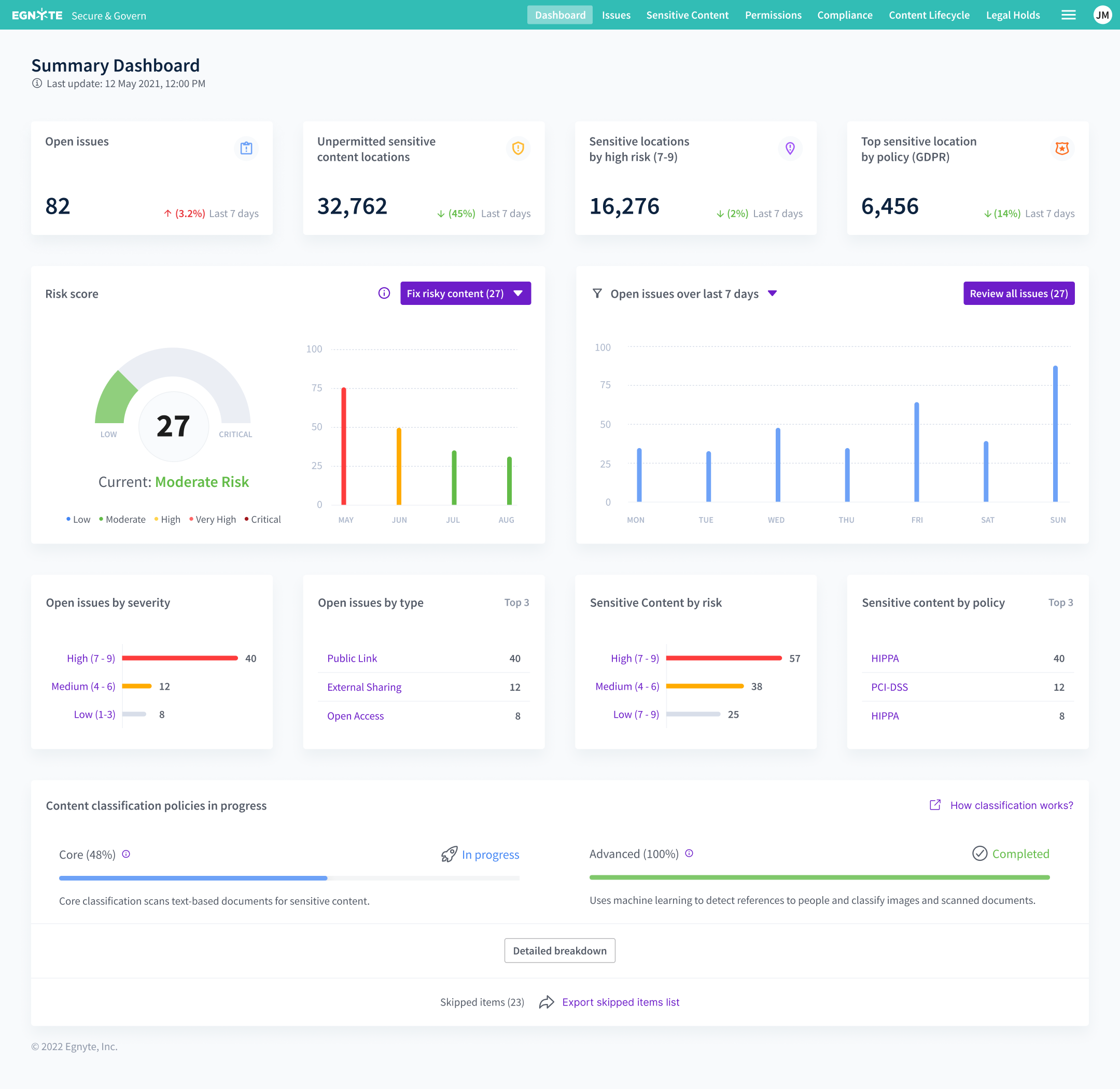
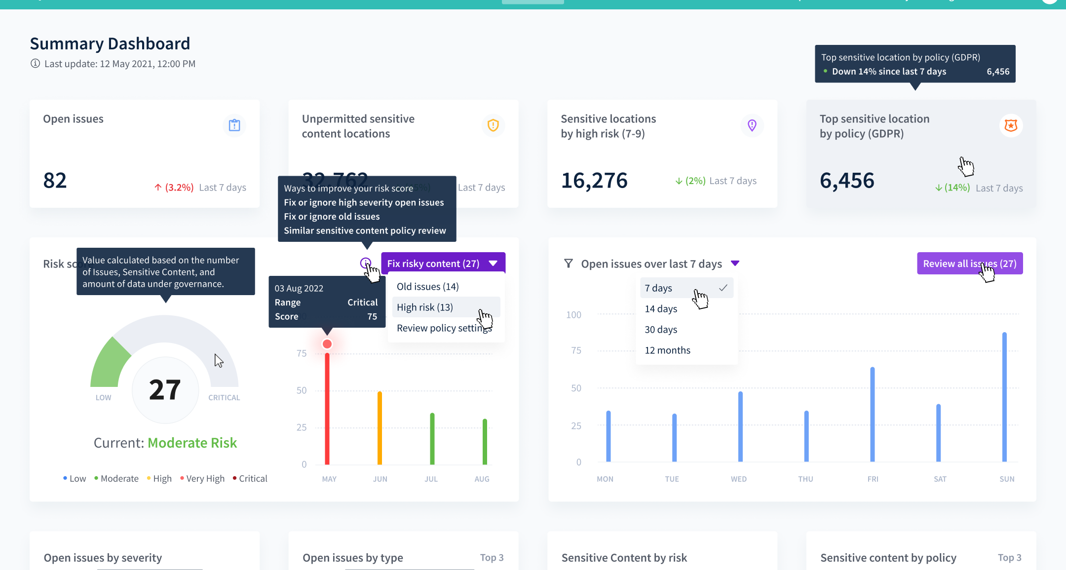
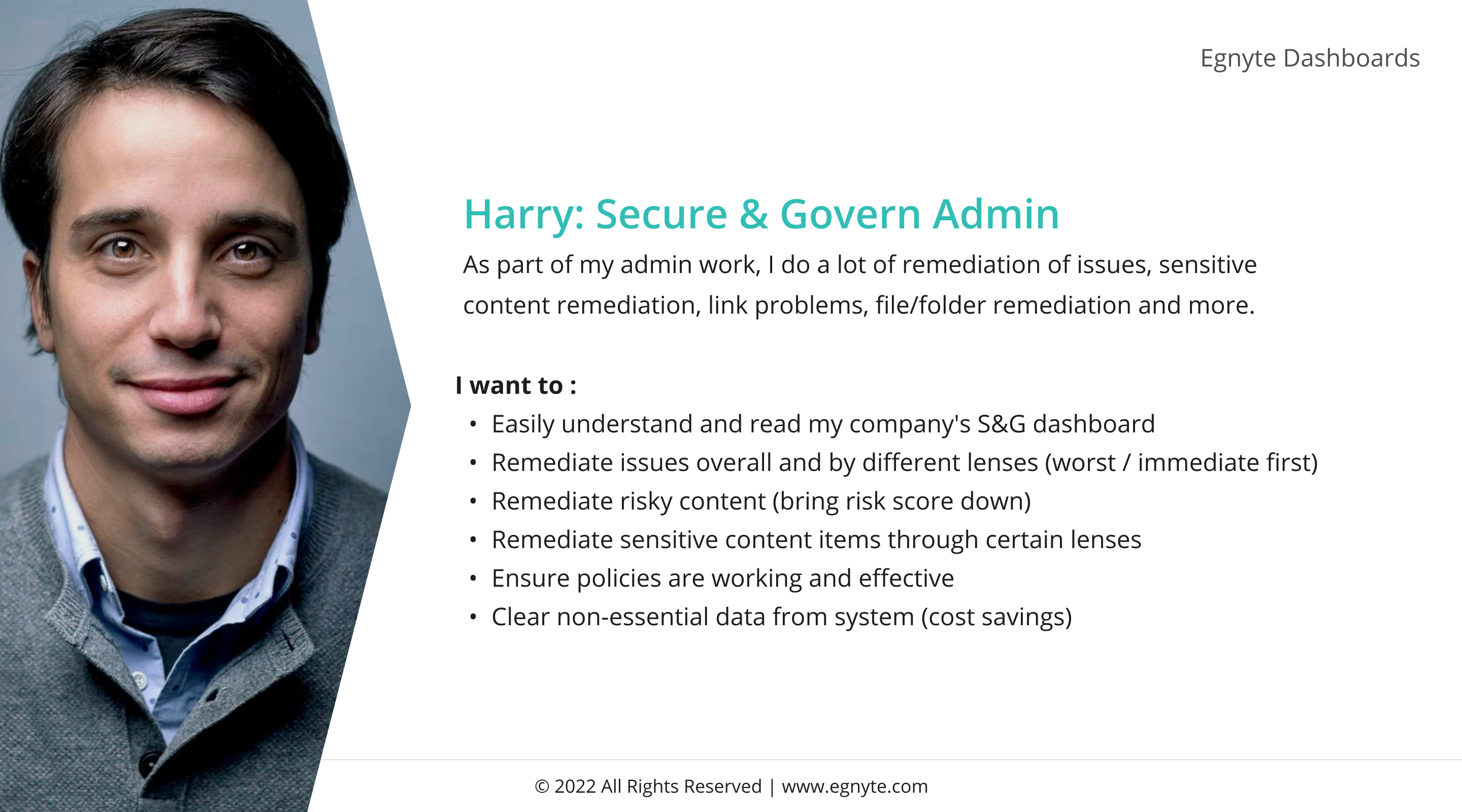
A Secure & Govern admin running daily remediation triage, sensitive content review, and link/folder cleanup. Wants to see his risk score, fix it, and keep storage costs down.
A dashboard that explains itself in one glance, lets him drill from any tile into the actual remediation queue, and remembers what he last cared about.
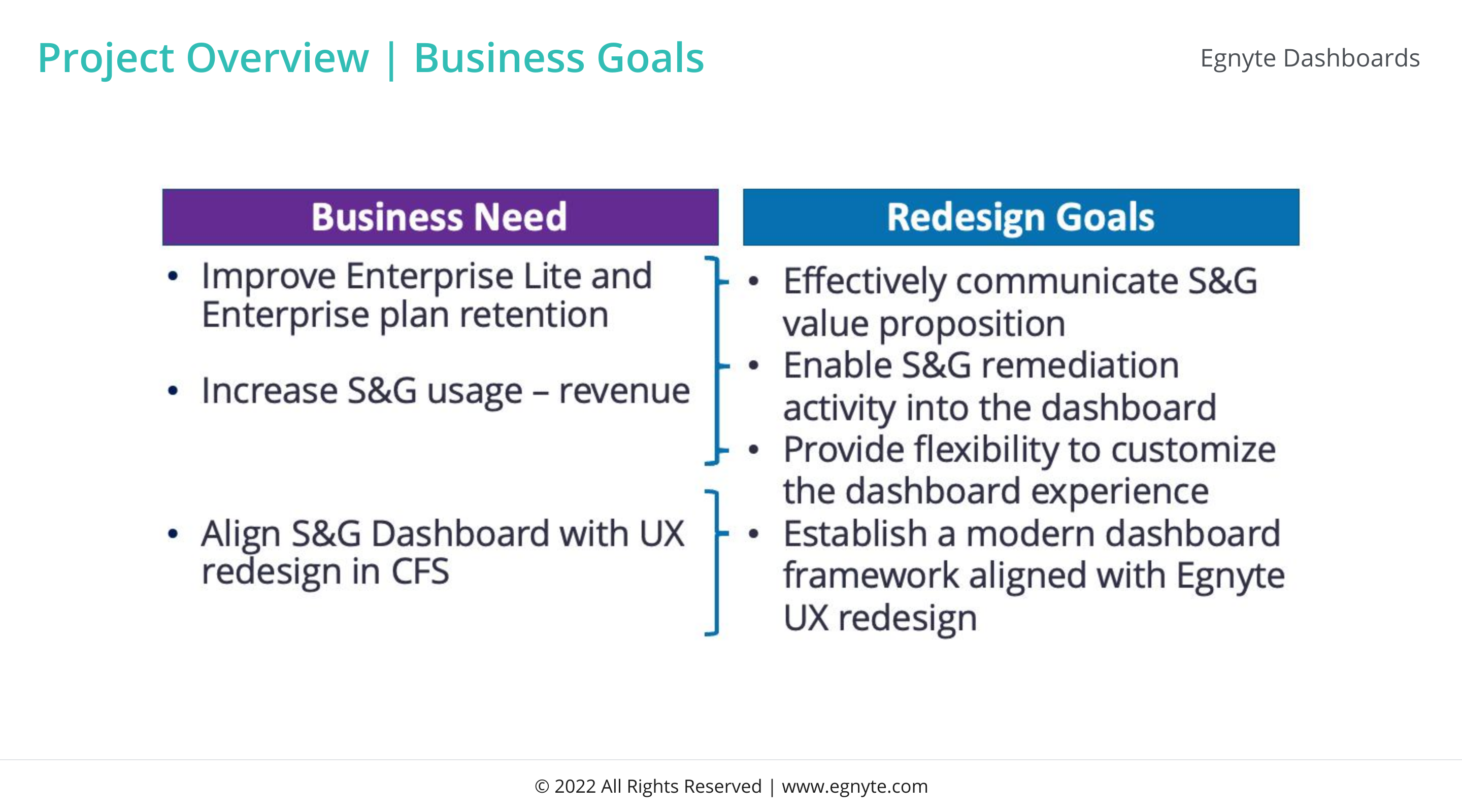
Communicate S&G value, enable remediation inside the dashboard, allow customization, and align with the new Egnyte UX. Drive adoption on Enterprise + Enterprise Lite.
Every design decision had to sell, function, and scale. The dashboard is a sales tool and a workspace.
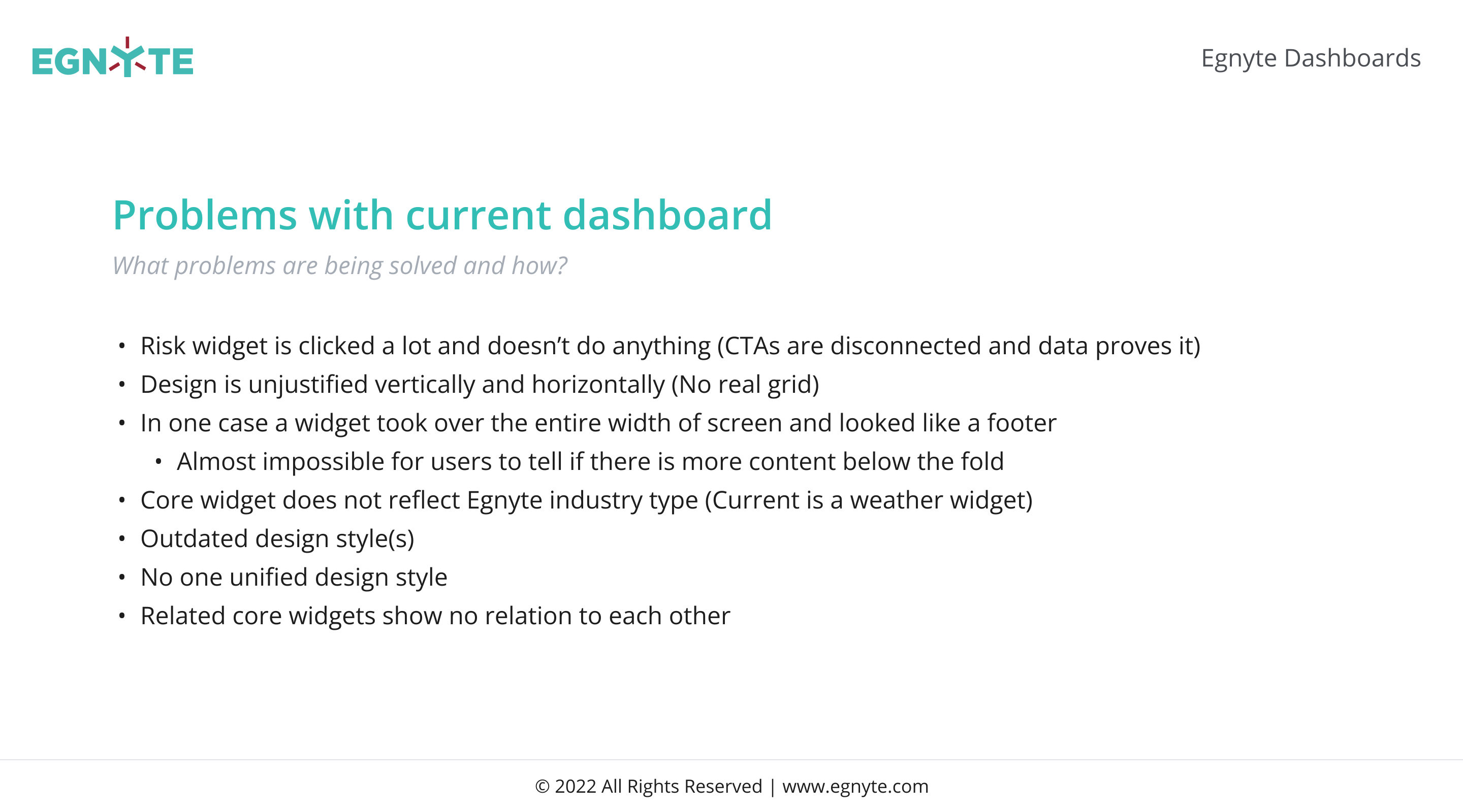
Risk widgets that clicked but didn't function. Disconnected CTAs. Full-width widgets that ate the screen. A risk gauge styled like a weather forecast that looked clickable but wasn't.
No unified system, so every widget invented its own pattern. Fix the system, not the symptoms.
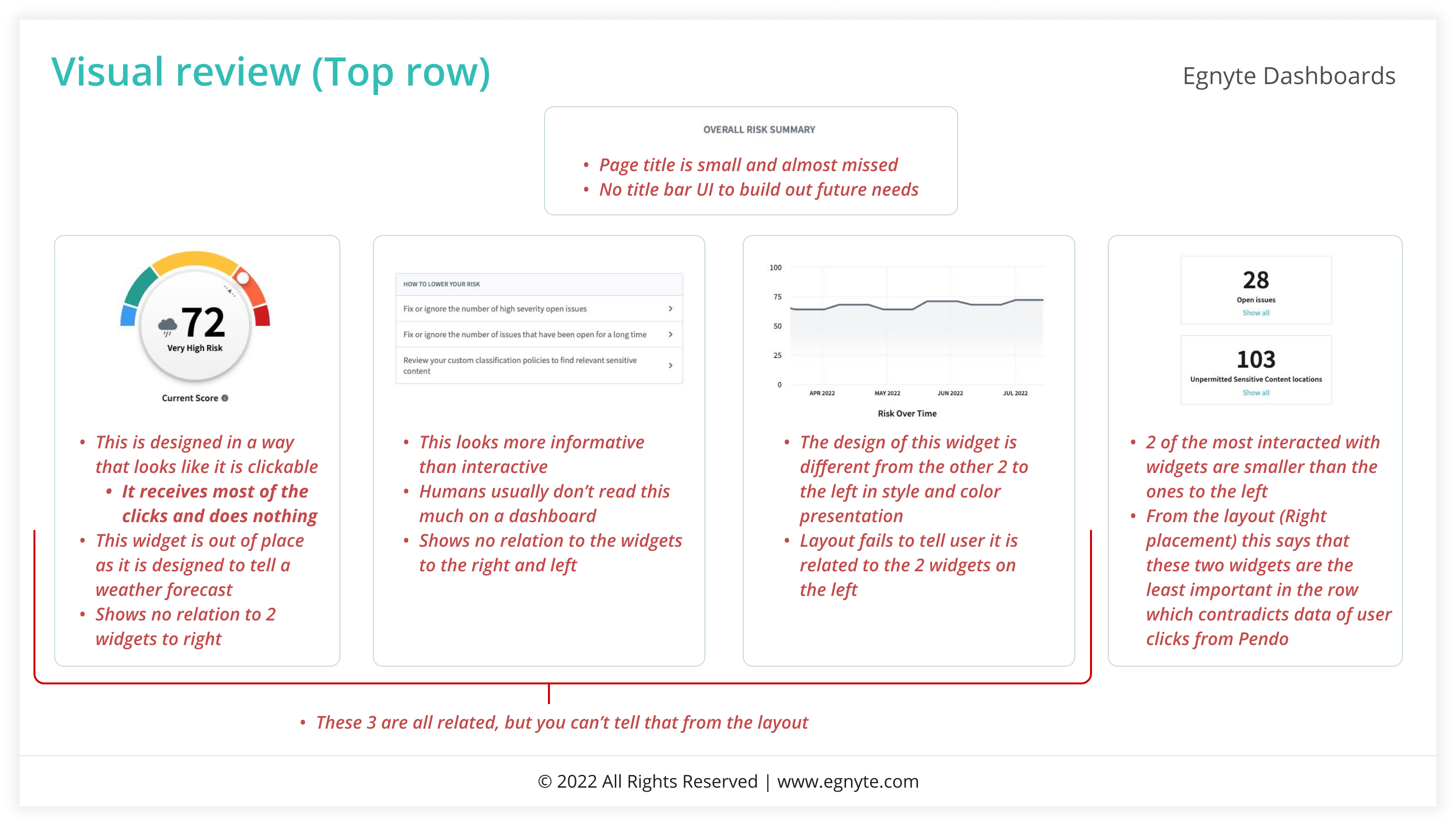
Every core widget was orphaned. No shared language, no consistent layout, no agreement on how a "score" or a "list" should look or behave.
Treat widgets like a library, not bespoke artwork. The library was Phase 1.
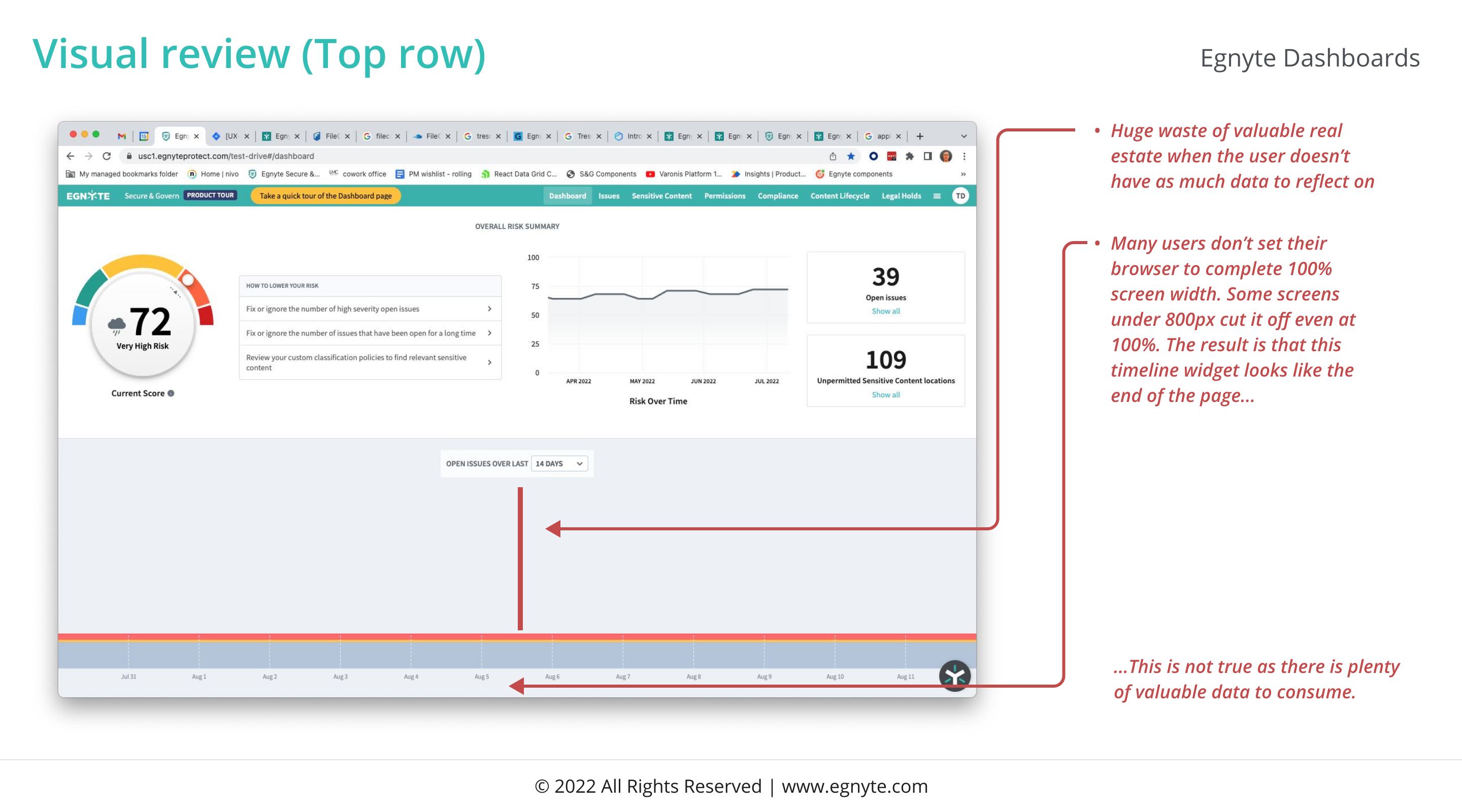
Critical content kept landing below the fold. Widgets sized themselves to the screen, not the data, so admins missed the most important risk metric every time they loaded the page.
Tighter widgets. Predictable above-the-fold zone. The most important answer first, every time.
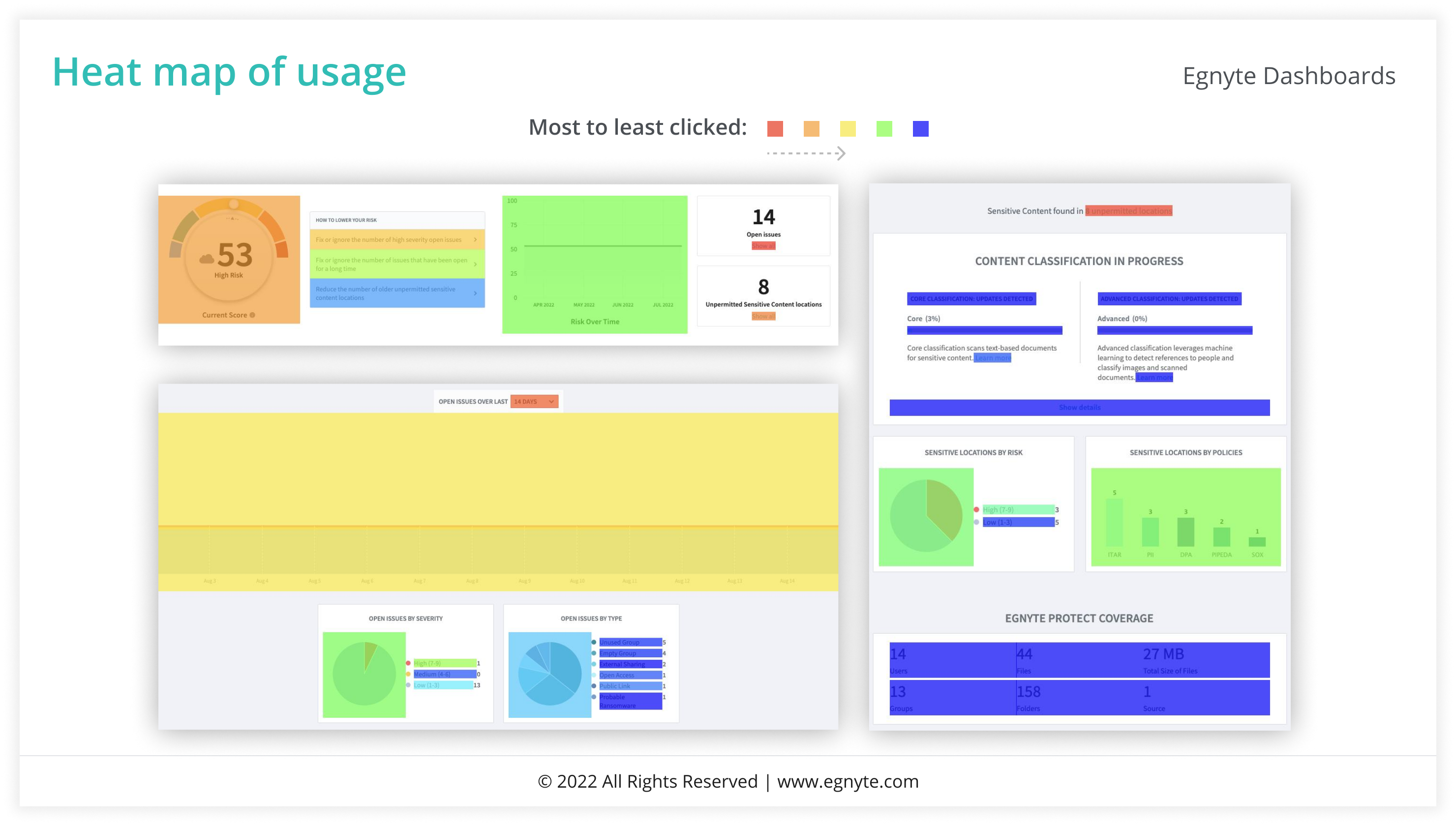
Pendo heatmaps mapped exactly where admins clicked, hovered, and gave up. The weather-forecast risk gauge was the most-hovered, never-clicked element on the page.
If a widget looks interactive, it must be interactive. Anything else is a broken promise.
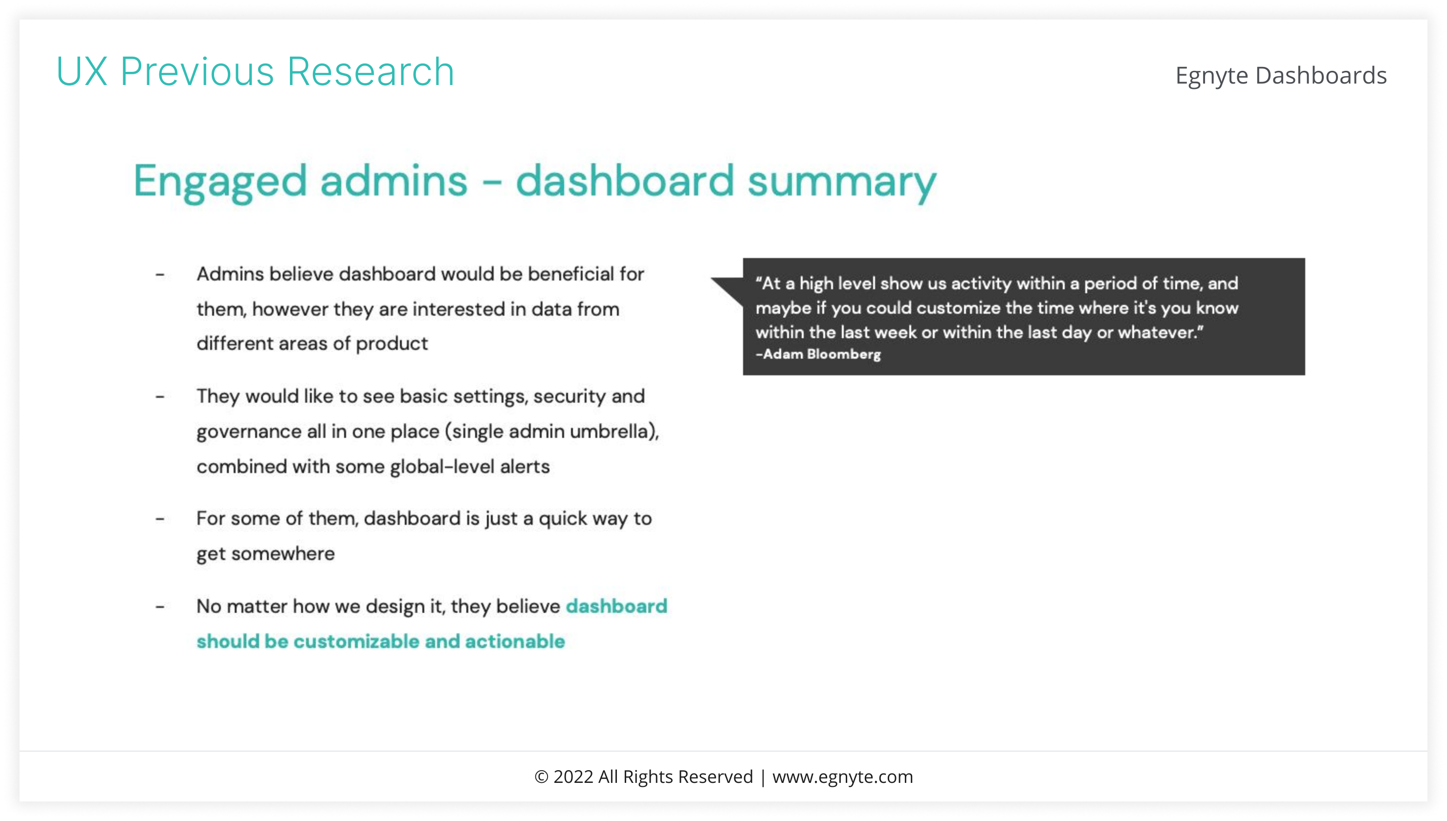
Daily users who lived inside S&G. They had workarounds for everything, which masked the system's real cost. Their feedback drove the priority order for the new framework.
Power users were masking the broken UX. Designing for them alone would have hidden the bigger problem.
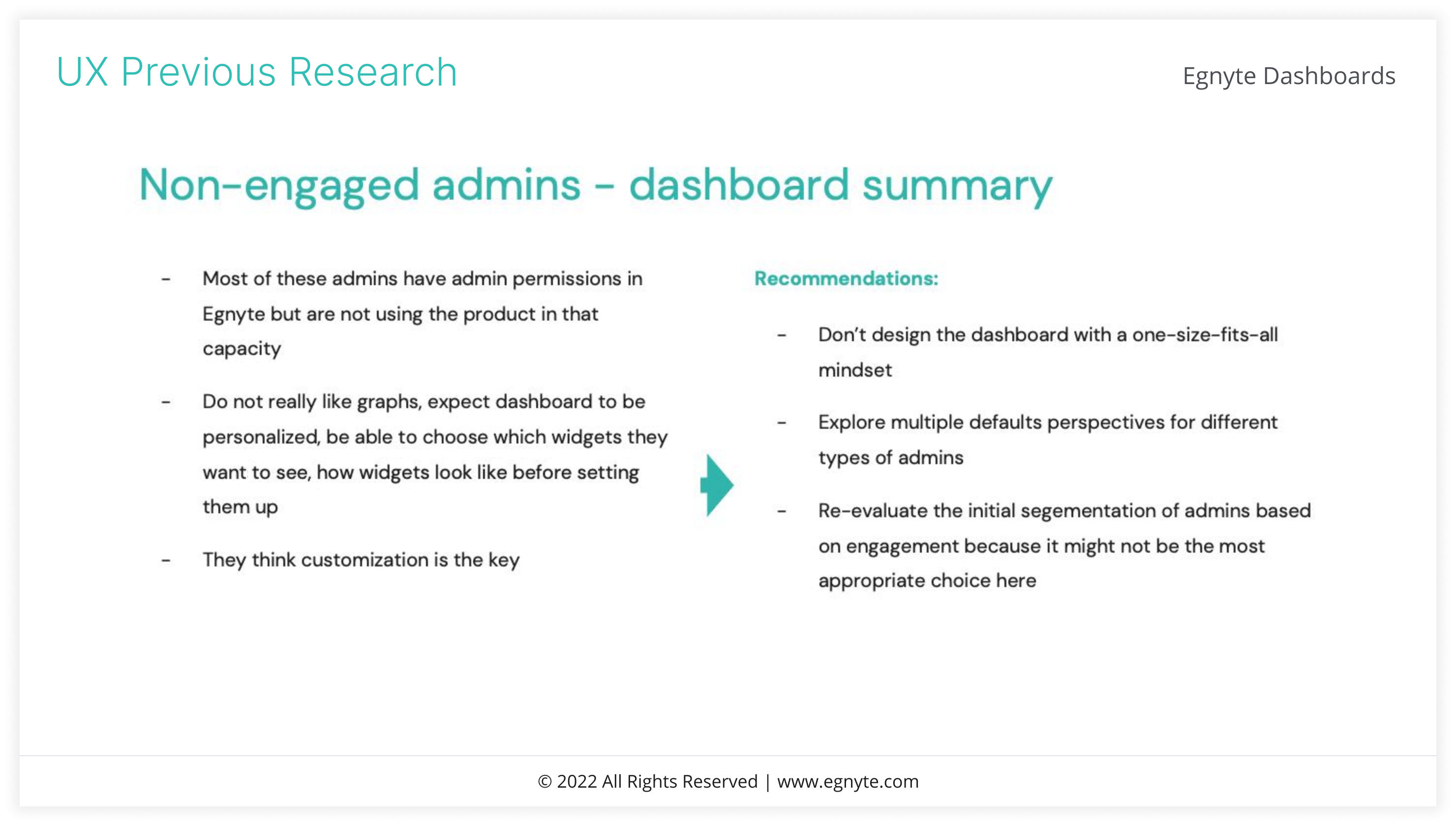
Admins who logged in once, didn't see what to do, and never came back. The dashboard's first impression was costing the team retention on Lite plans.
The dashboard had to onboard, not just display. Empty states earned a real design pass.
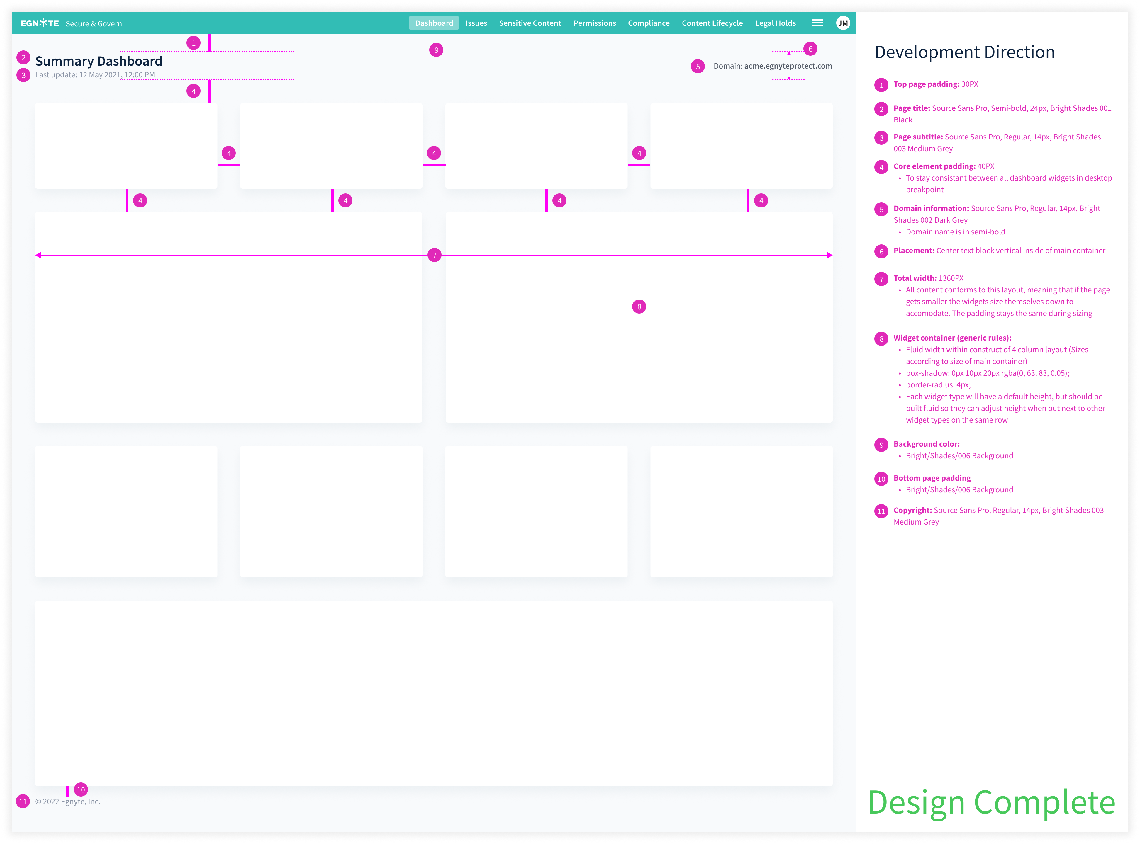
One responsive grid that every widget snaps into. Same anatomy across Enterprise, Lite, and any future Egnyte dashboard. Designed once, deployed everywhere.
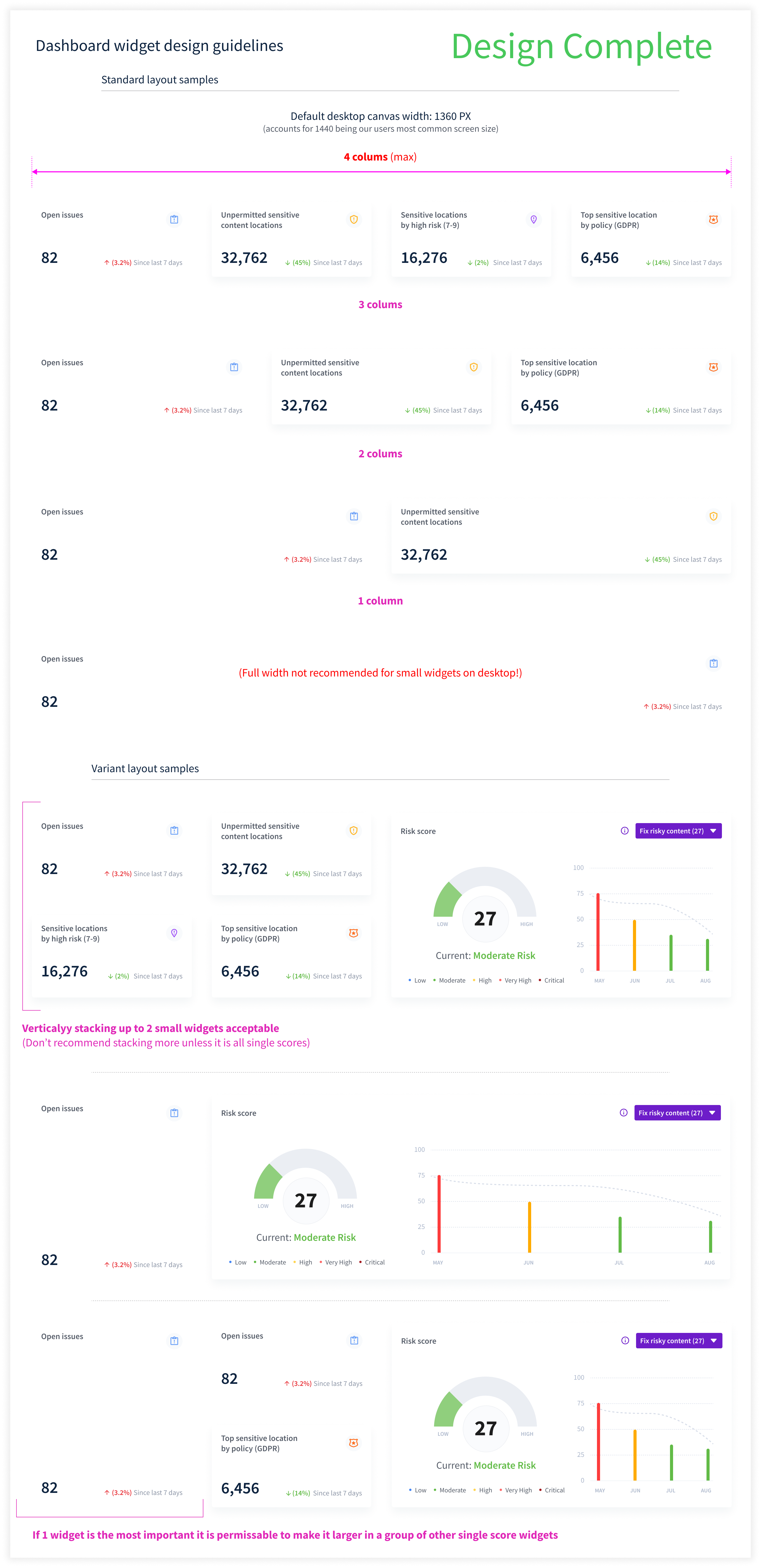
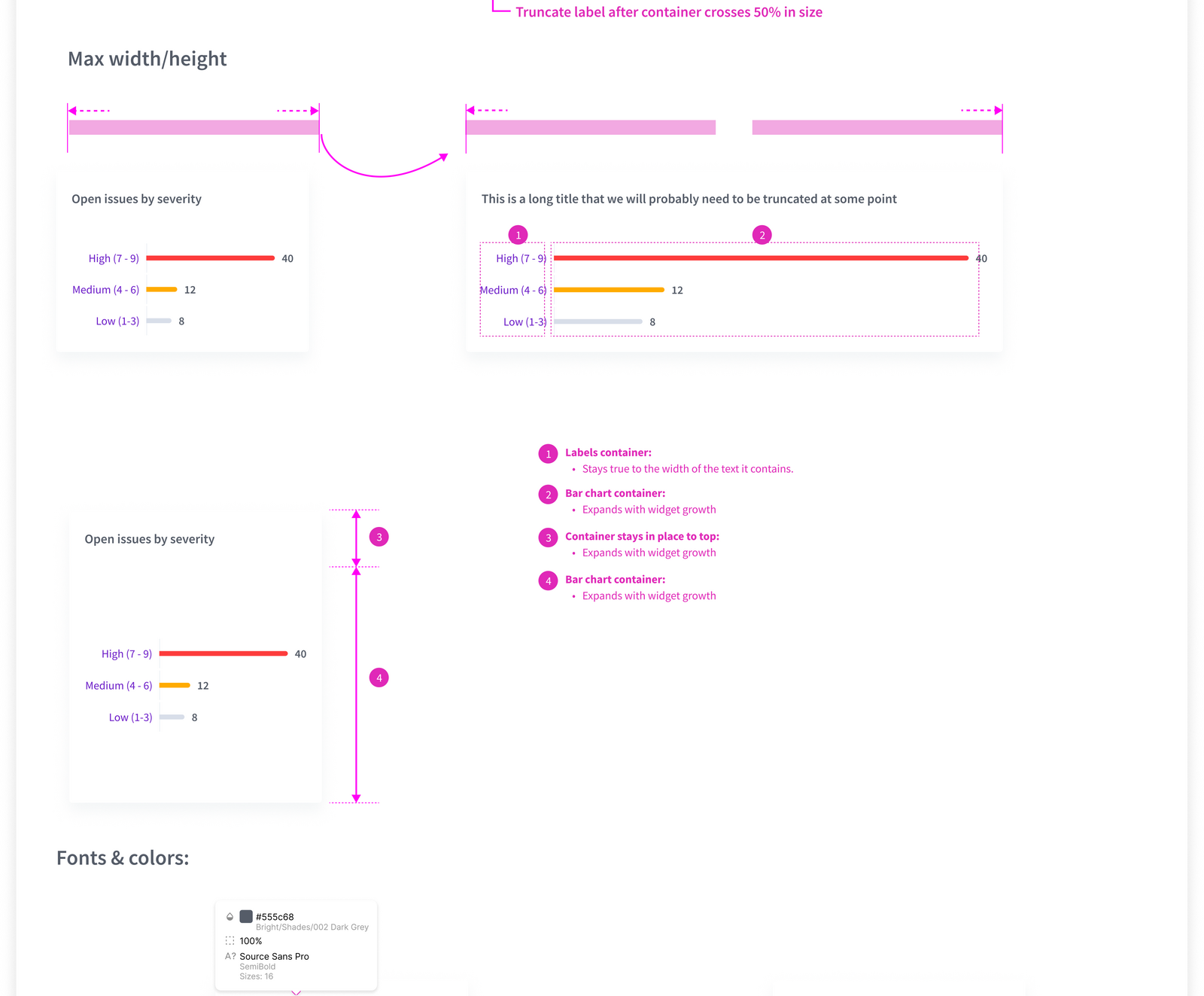
Sizing, padding, type scale, color tokens, accessibility floor, and the rules each widget must keep to live in the system. Predictability is the feature.
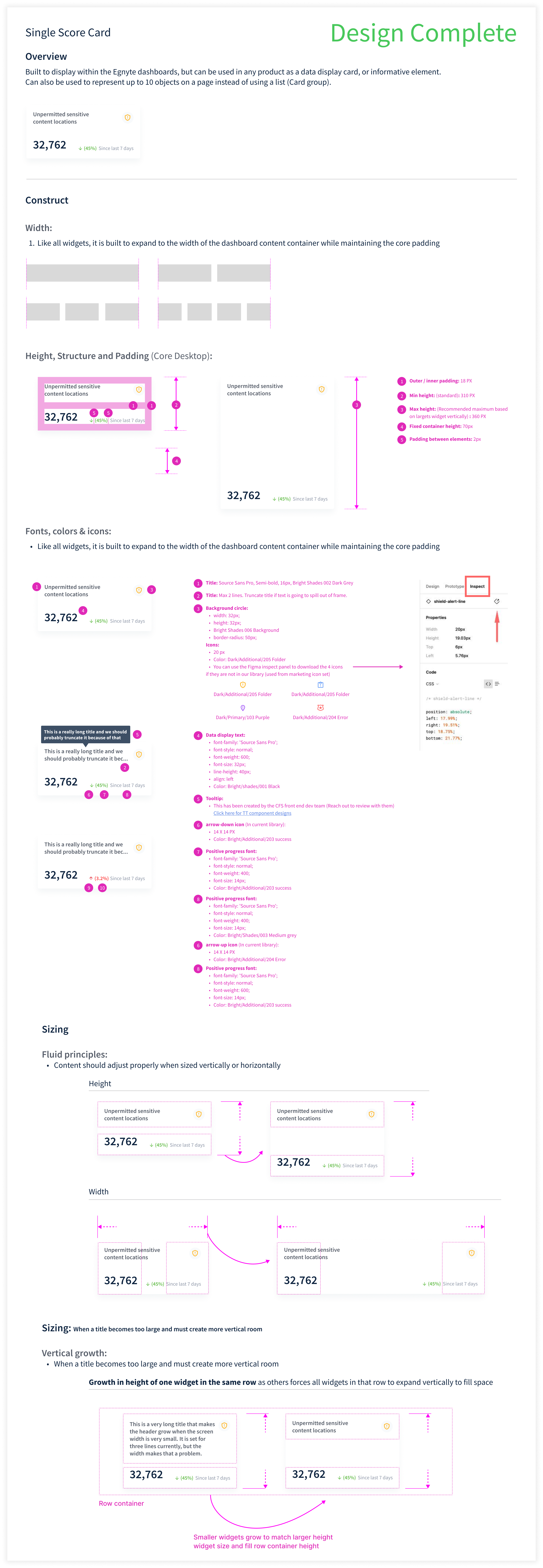
Every widget shipped as a fully-specced component. States, tokens, interactions, edge cases. 95% vetted by front-end engineering before handoff.
Personalized previews, in-product onboarding, marketing illustrations. A dashboard becomes a feature only when customers can see themselves using it. So I built the surrounding surface — every Egnyte customer received a personalized preview rendered with their own data, in-product modals walked admins through what they were looking at, and the marketing illustrations stitched the story together for sales.
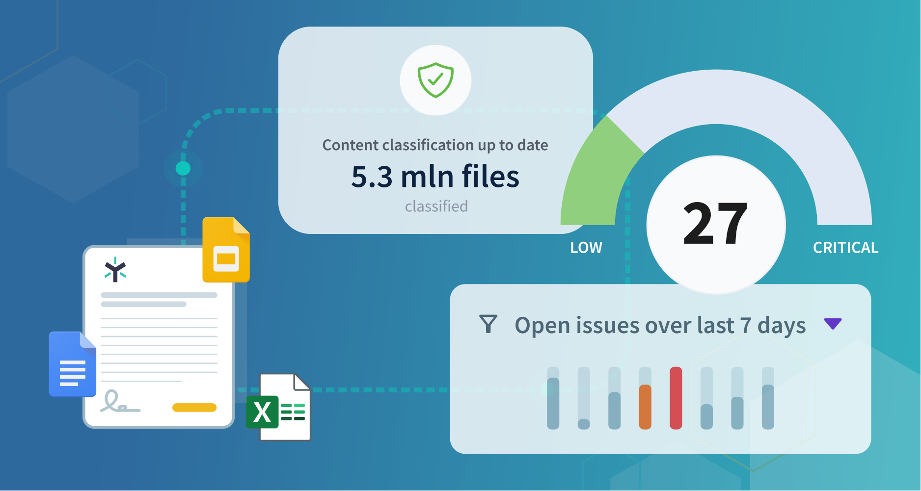
The hero illustration translated an abstract governance product into something a buyer could see in one glance. Files flowing into a dashboard: Word, Excel, PowerPoint, PDF feeding the risk-score gauge, classification stat, and open-issues bar chart, set on Egnyte's blue gradient with the hex pattern. Built so the dashboard didn't have to explain itself — the illustration did.
Anchored the launch landing page, the sales enablement deck, the partner microsite, and the in-product onboarding hero tile. One asset, every surface a customer might first hear about Secure & Govern from.
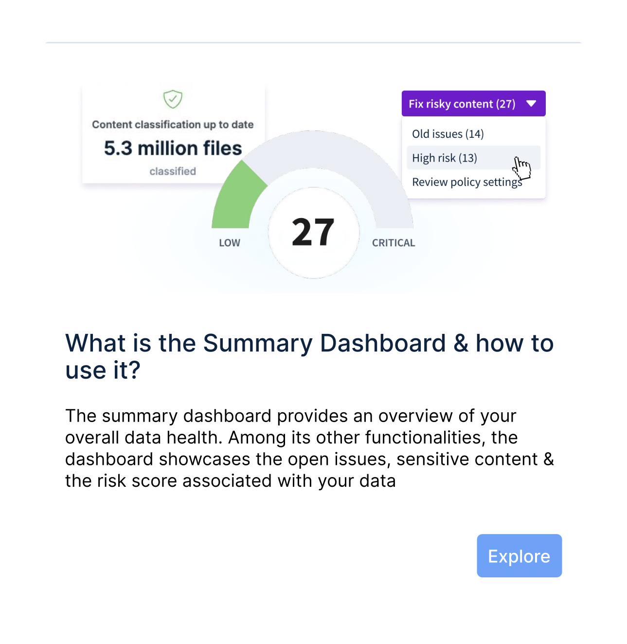
Educational modals introduced new admins to the Summary Dashboard, the Risk Score (Low → Critical), and the ‘Fix risky content’ dropdown (open issues with high sensitivity, older open issues, older unpermitted sensitive content). Light, dismissible, and tied to the launch so customers learned by using, not by reading docs.
First-run modal series across the Summary Dashboard, Open Issues, Sensitive Content Locations (by Source or Risk; by Policy), Risk Score, and Content Classification surfaces. Triggered once per admin, with an ‘Explore’ CTA that dropped them into the surface itself.
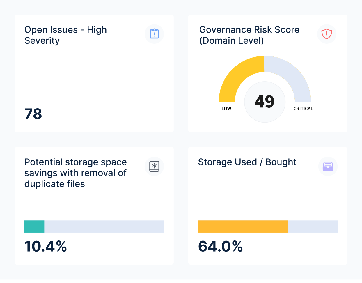
A render of the dashboard system populated with the customer's own numbers, not stock placeholder data. The example here is GHL: 78 high-severity issues, 49 governance risk score, 10.4% potential storage savings, 64.0% storage used. The same Open Issues / Governance Risk Score / Storage layout as the live product, so the customer sees themselves in it before they ever log in.
Sales outreach, executive briefings, and partner intros. One render per named account; the GHL example here was the partner-facing variant. Eight customer renders shipped from this same template.
For a data storage company like Egnyte, finding the right file quickly is key.
Quick View, in the right drawer.
Phase 1 lead designer/researcher.
No way to quickly visualize files.
Metrics, heuristics, competitors.
Full team participation.
Phase 1 design, four-person UX + CI team. Synthesis became Quick View. Joe led the effort and V1 design, Jarek polished.
Joe had been raising the preview problem for months. CFS and Secure & Govern both. The director cleared time to research it. Product bought in.

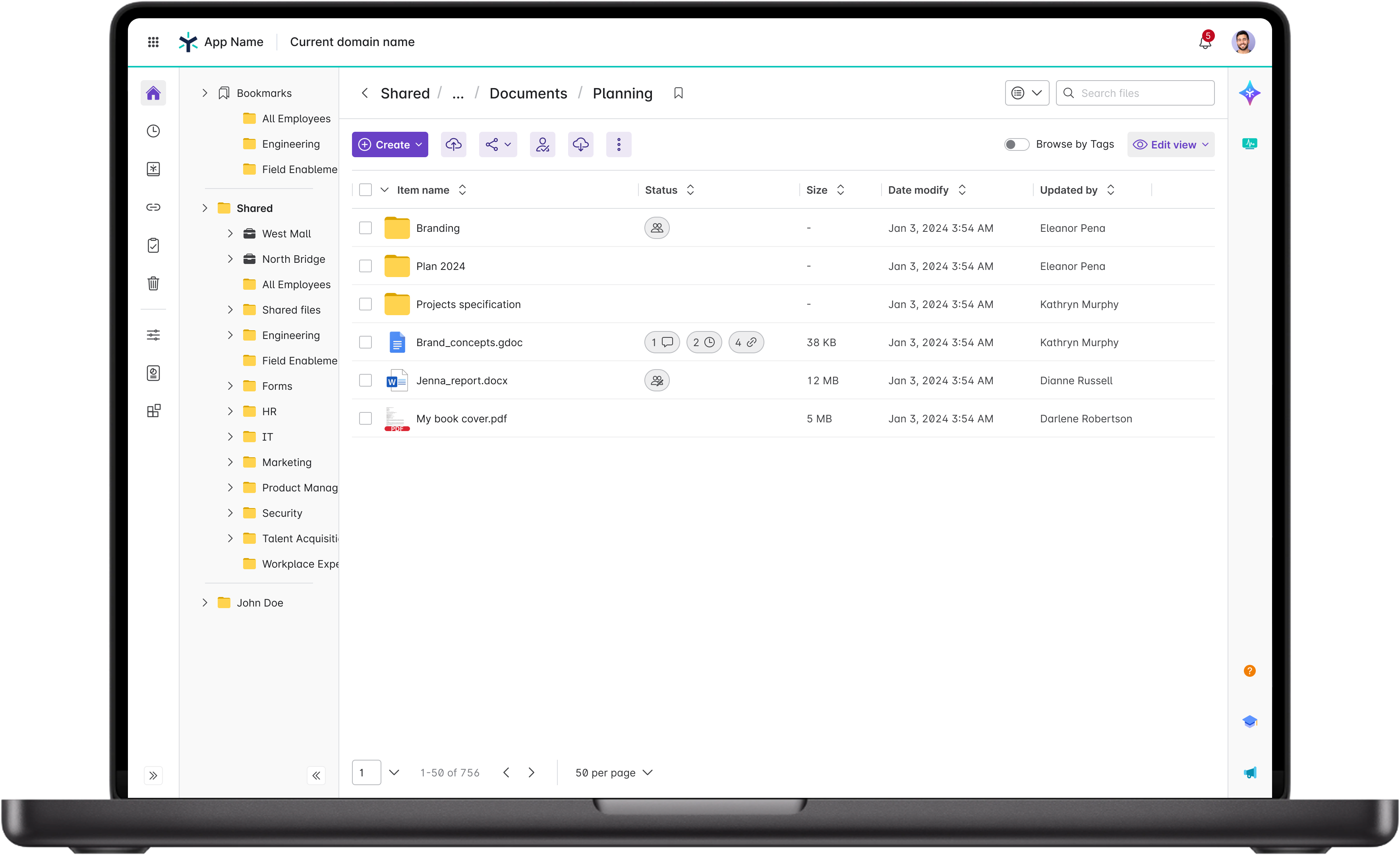
Egnyte's CFS file list, pre-Quick-View. This is where users come to find their files and folders.
The most-visited page in the platform. Whatever happens here happens to almost every customer and end user. The entry point could not get any heavier. Something on it had to give.
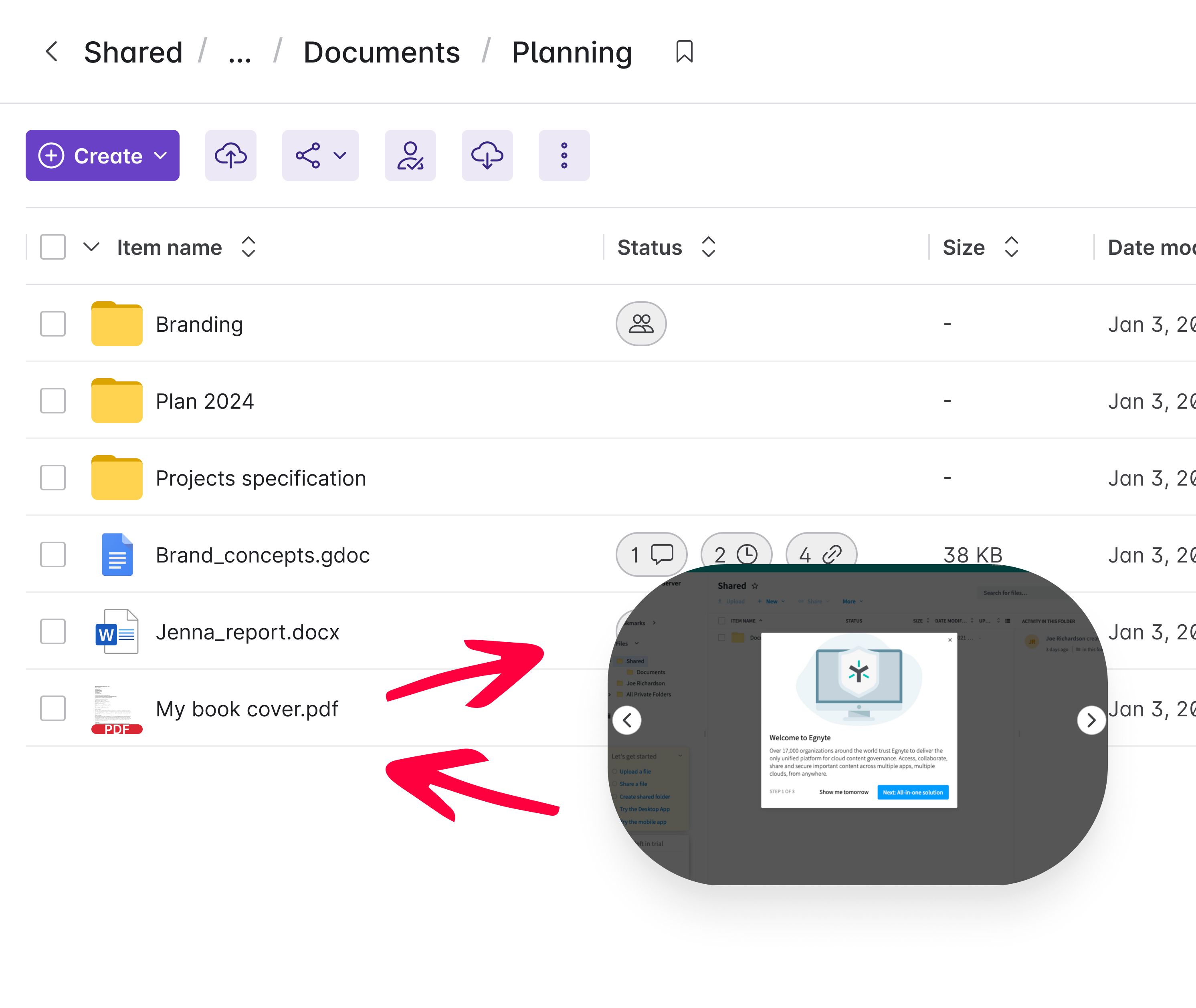
From here, the only way to confirm a file was the right one was to click it, go to full preview, wait for load, possibly paginate or scroll through the file to verify content, then back again if it was the wrong one.
Users were overwhelmingly of the opinion that they wanted a quick way to explore a file without leaving the context of the files and folders view.

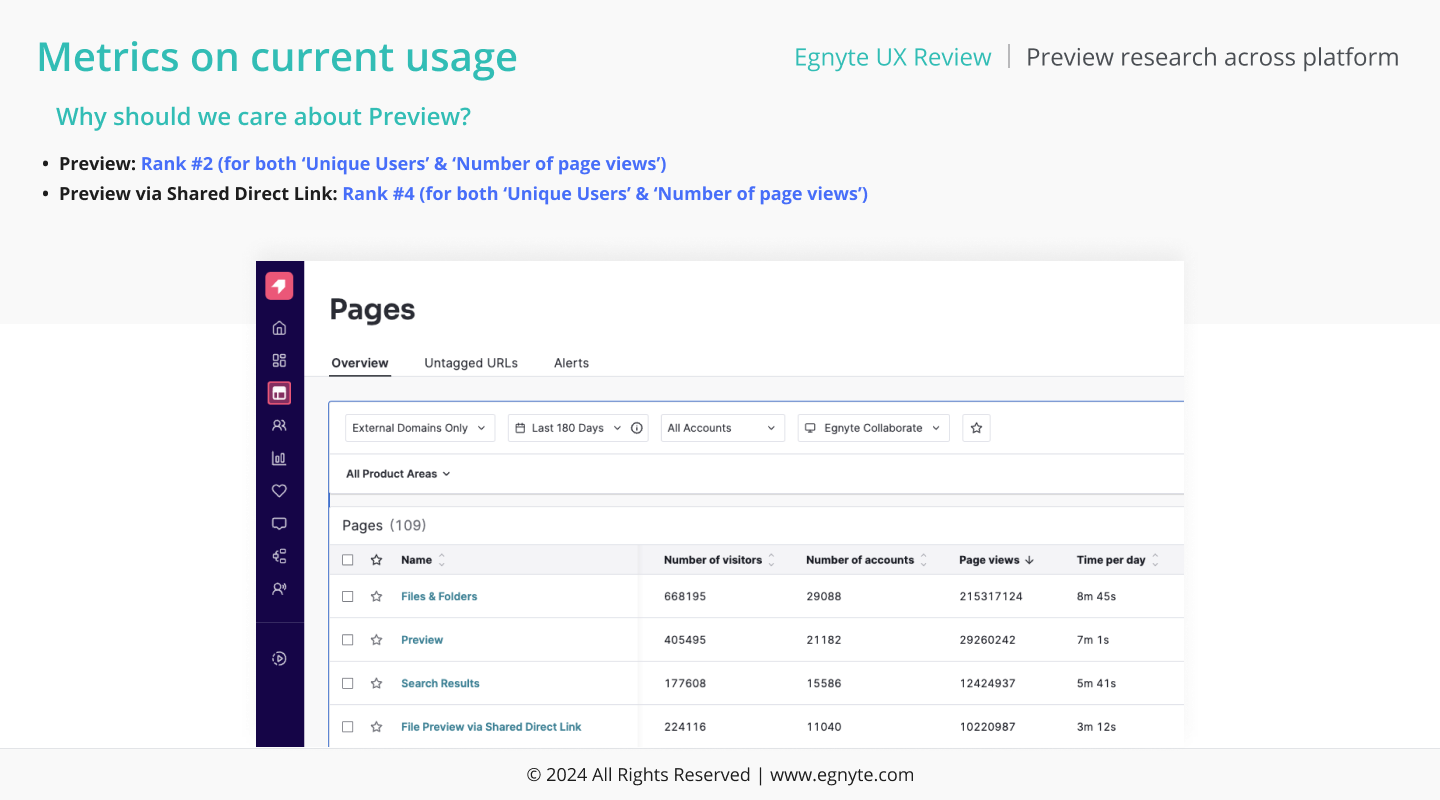
The path after Preview is a tight loop. Users bounce back to the list, re-sort, re-scroll, re-enter Preview, often inside a second. The page is a checkpoint, not a destination.
405,495 unique users. 29.2 million page views. 7 minutes 1 second per day. Preview ranked #2 by volume and time. File Preview via Shared Direct Link was #4.
Every glance cost a round-trip. Across 20,000 customer organizations, that adds up to hours a day spent bouncing.
Preview was not a viewer. It was a workspace. The round-trip was the bug. The fix had to live on the file list, not on a separate page.

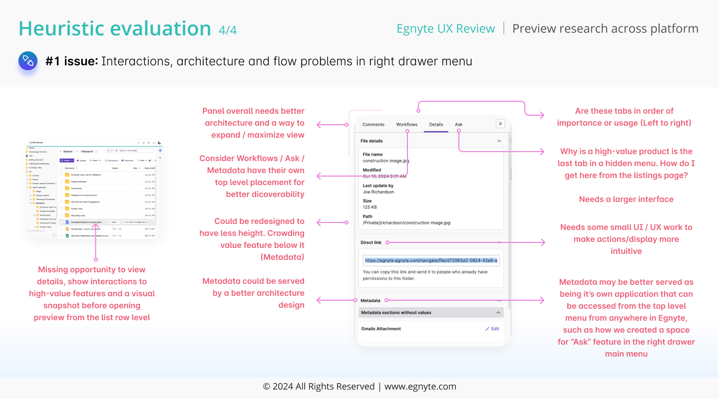
The full preview page hid every side action in a right-hand drawer. Comments. Workflows. Details. Ask. All four collapsed by default. To act, you opened the drawer, clicked the tab, then worked on the file. Three clicks before you started.
You could see the file. You could not act on it without a second click. So you left. Back to the list, on to the next file, instead of doing the work in front of you. The drawer made round-tripping easier than working.
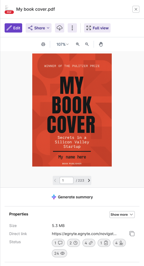
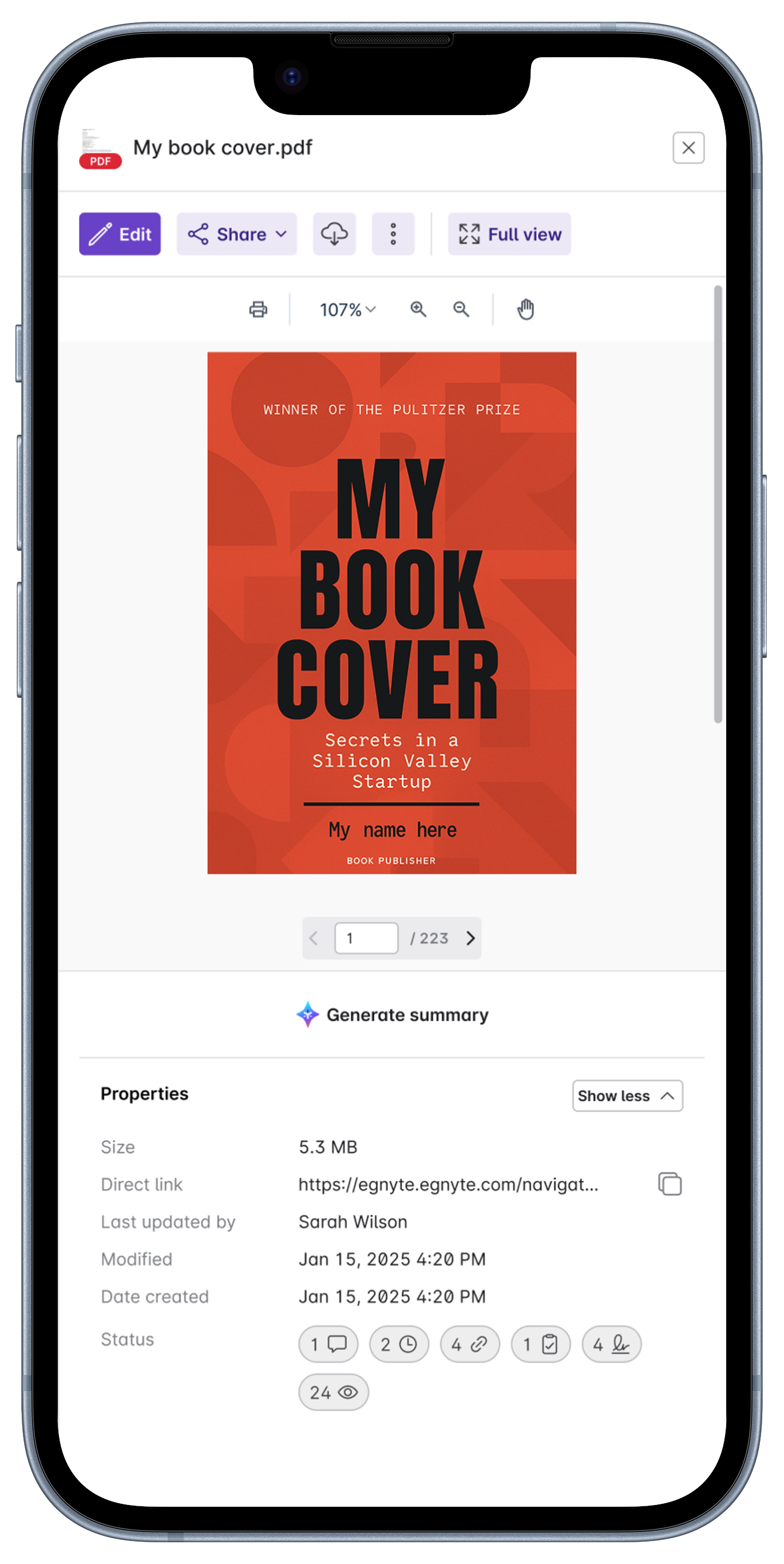
Quick View put actions inline. Comments. Ask. Generate Summary. Share. Visible at the top of the panel. One click each.
Drove the same-page panel architecture in the shipped product. Same actions. Half the clicks.
Lukasz on insights, Harsh on data, Ayesha + Rakesh on competitive, Joe on heuristics. Four lenses, one finding.
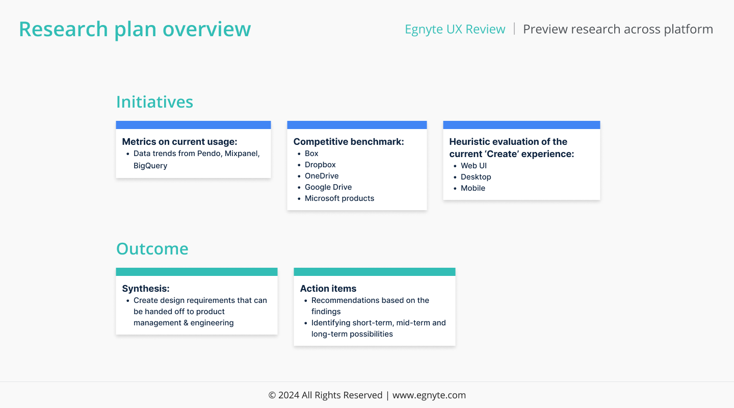
Three workstreams ran in parallel: metrics on current usage (Pendo, Mixpanel, BigQuery), competitive teardown of four file-share platforms, and heuristic evaluation across WebUI, Desktop, and Mobile.
Without a deliverable named up front, the team would have spent the quarter on a literature review instead of a brief.
Naming the inputs and the outputs kept the team out of analysis paralysis.
Pendo, Mixpanel, and BigQuery agreed. Preview was the #1 surface on every measure that matters — unique users, page views, time on page. Where users uploaded, downloaded, and went looking for their important data.
It was getting workspace-level traffic with viewer-level investment.
The rank gave the team air cover to actually invest in the surface, not just maintain it.
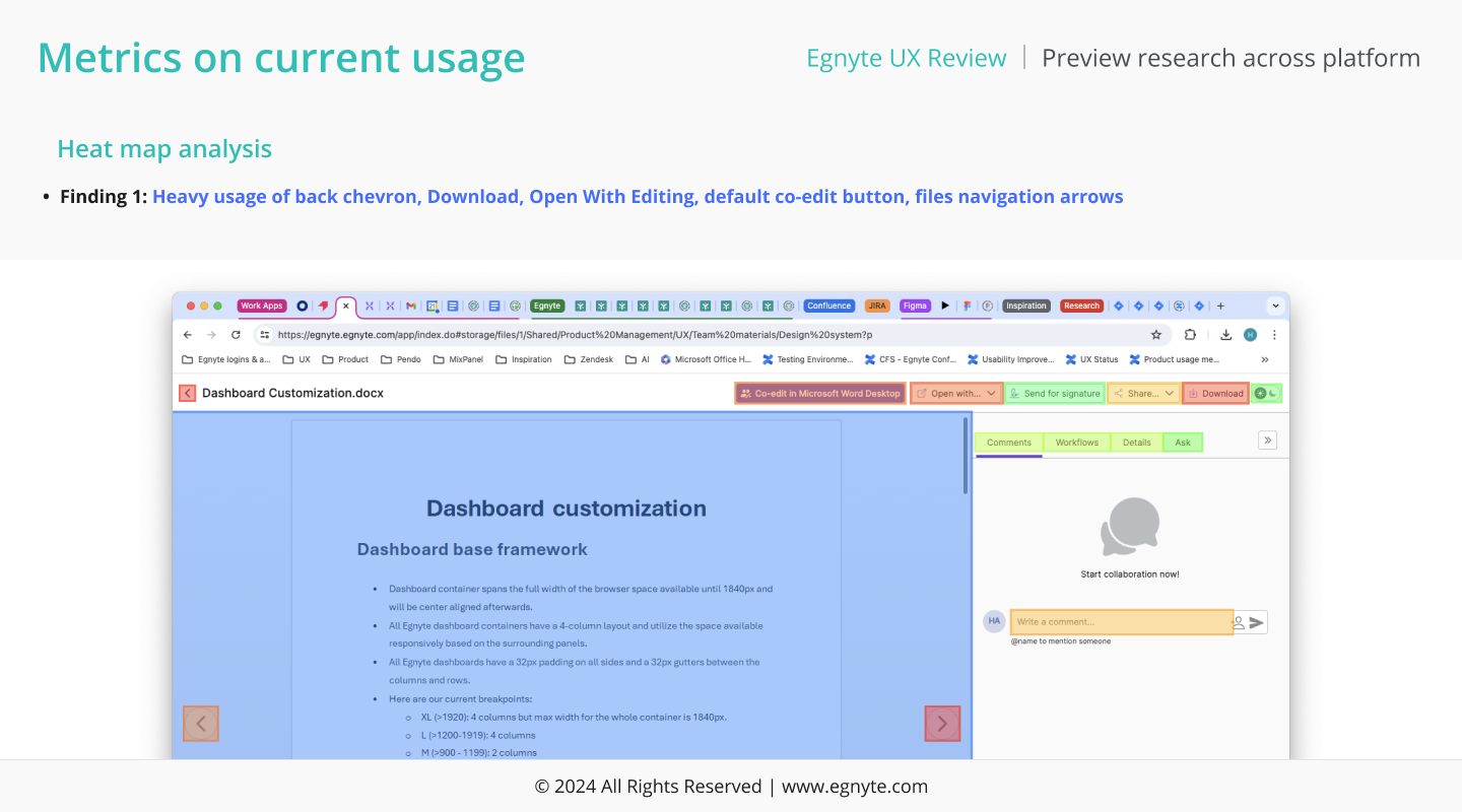
Tracking the path users took after landing on Preview surfaced a tight loop. They bounced back to the file list, re-sorted, re-scrolled, and re-entered Preview — often within seconds.
Every glance at a file was a round-trip. Multiplied across 20,000 customer organizations, that's hours a day spent bouncing.
Preview wasn't being used as a viewer. It was being used as a workspace, and the round-trip was the bug.
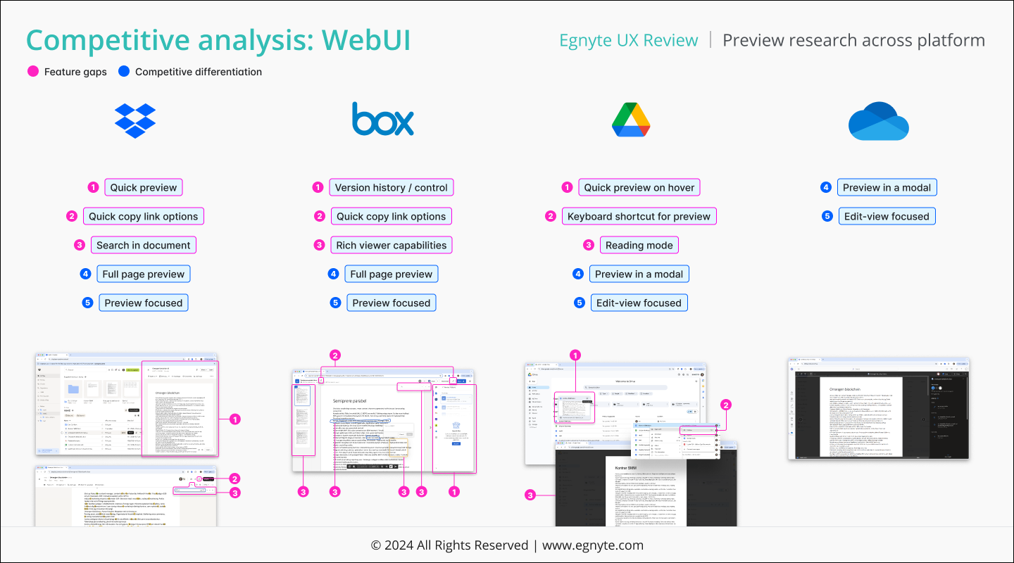
Co-led with Ayesha and Rakesh. Tore down each competitor's preview model — quick preview, search-in-document, modal preview, edit-view focus — and lined them up against ours.
Hover preview. Keyboard shortcut. Reading mode. Modal preview. Table-stakes elsewhere, missing here.
The popover-or-modal pattern was an industry consensus we hadn't acted on.
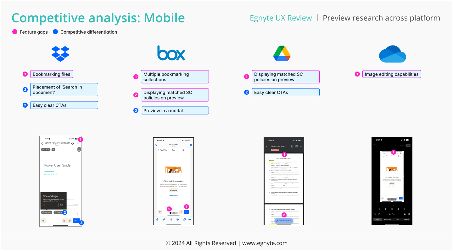
Same teardown, mobile surface. Bookmarking placement, search-in-document, multi-bookmark collections, sensitive-content policy display, modal preview, image editing.
Modal preview and sticky in-document search were the patterns competitors leaned on. Both absent from ours.
The mobile spec needed to be drawn from the same well as desktop, not delivered as a downsized afterthought.
Heuristic evaluation surfaced five categories of largest problems. The right drawer was the through-line: tab order, content density, action placement, refresh behavior, and discoverability all pointed to it.
The drawer was treated as overflow space, not as a peer surface to the file list.
Fix the drawer's contract and the five issues collapse to one.
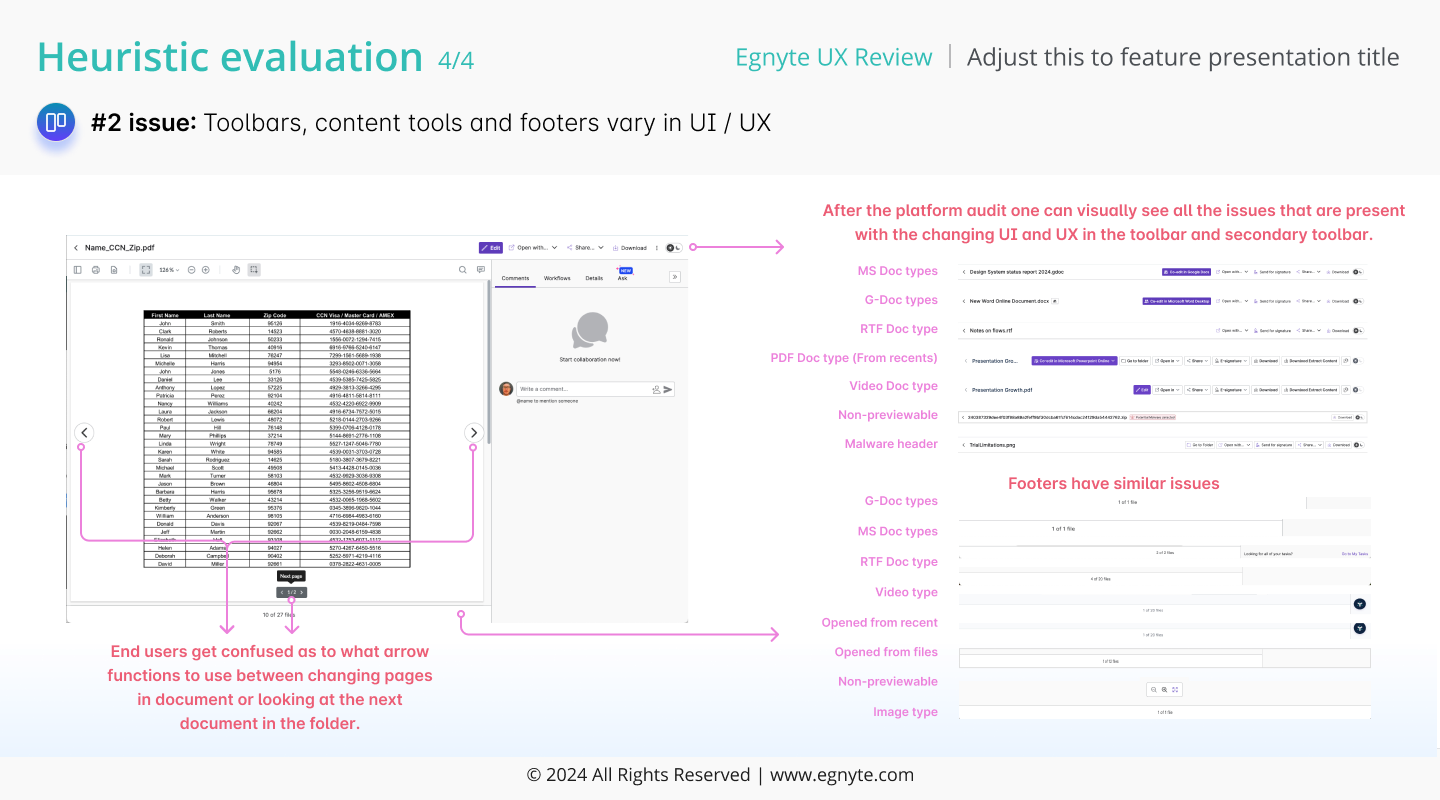
MS Office, Google Docs, RTF, PDF, video, non-previewable, malware-headed — each opened with a different toolbar, content tools, and footer. Same surface, seven flavors.
Engineers were maintaining seven preview shells when the user only needed one.
Standardizing the model became part of the brief — for users AND for the team building it.
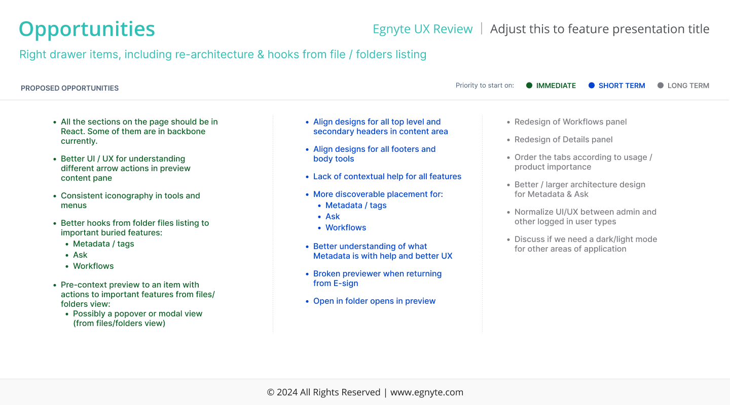
Joe and Harsh ran the synthesis together. Eighteen actionable items, split into Immediate, Short term, and Long term — each tagged to the research finding it answered.
Without prioritization, the team would have spent the quarter triaging instead of building.
One immediate-priority line on this slide read: “Pre-context preview to an item with actions to important features from files / folders view: possibly a popover or modal view.” That line became Quick View.
The right drawer already existed, doing light work. The thesis was simple. Pull every preview intent into that drawer. Keep the file list put.
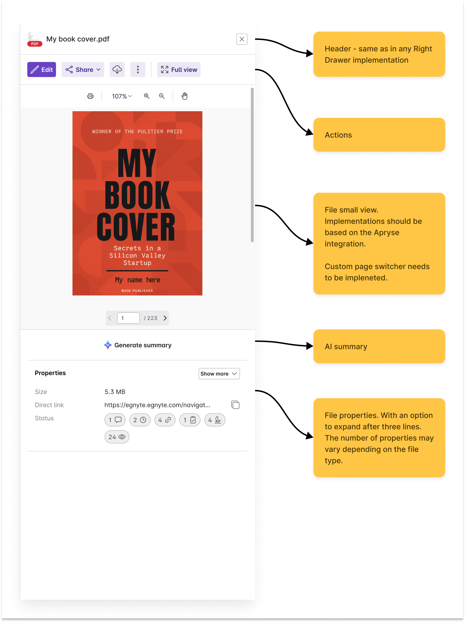
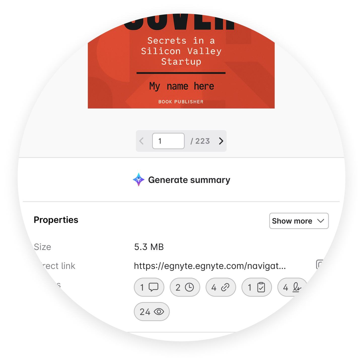
Quick View, broken into five named regions. Header. Actions. File view. AI summary. Properties. Each region pinned to one owner and one behavior. The artifact went into engineering review with notes attached, so the spec and the build conversation lived on the same page.
The header inherits from every right-drawer feature, so no new chrome, just one component across the platform. The file viewer leans on the Apryse integration for parity across file types. The page switcher is a custom build. The properties block expands after three lines and varies by file type.
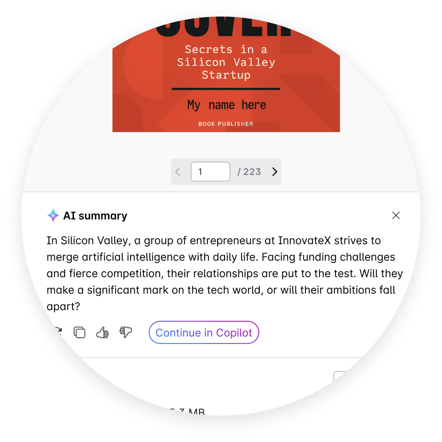
One spec the team built from. Header reused. Apryse runs the viewer. The page switcher built once, used everywhere. AI summary as a power to quickly understand and then an opportunity to use deeper conversational AI.
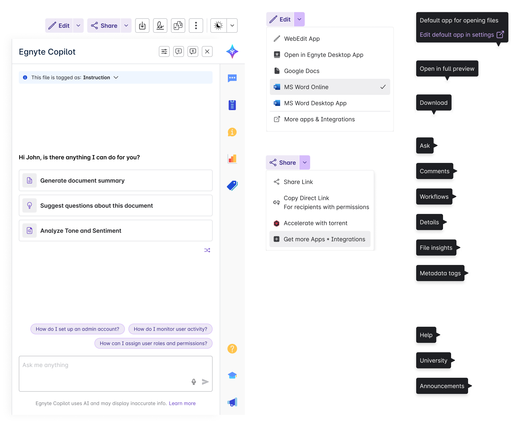
Mapping every action a selected file could hold in the right drawer. The Egnyte Copilot panel for AI assistance, with suggested jobs and an open prompt. Edit and Share drop-downs for familiar existing menu habits. A right-rail of tabs for Ask, Comments, Workflows, Details, File insights, Metadata tags, and Help. Every tab labeled on hover so the icon-only rail stopped being a guessing game.
Three kinds of panels, one selected file. The Copilot panel as a contextual AI helper. Edit and Share menus listing every editor and every contextual path the file could take. Tooltips on every rail icon so first-time users could find their way without clicking first.
Copilot, Ask, Comments, Workflows, Details, File insights, Metadata tags, Help. All as right-drawer tabs. Edit and Share kept as inline dropdowns. Tooltips on every rail icon so the drawer explains itself.
I'd love to hear about your next project, your company, and the mission behind it.
AI-powered companion built for the most overwhelming days of your life.
AI-native post-diagnosis navigator.
One letter, no map.
Seven days, held. Trustworthy AI.
Founder. End-to-end.
Public narratives. Five themes.
Three lanes. Refusal pattern.
Steady design system & Next.js.
Pilot 2026.


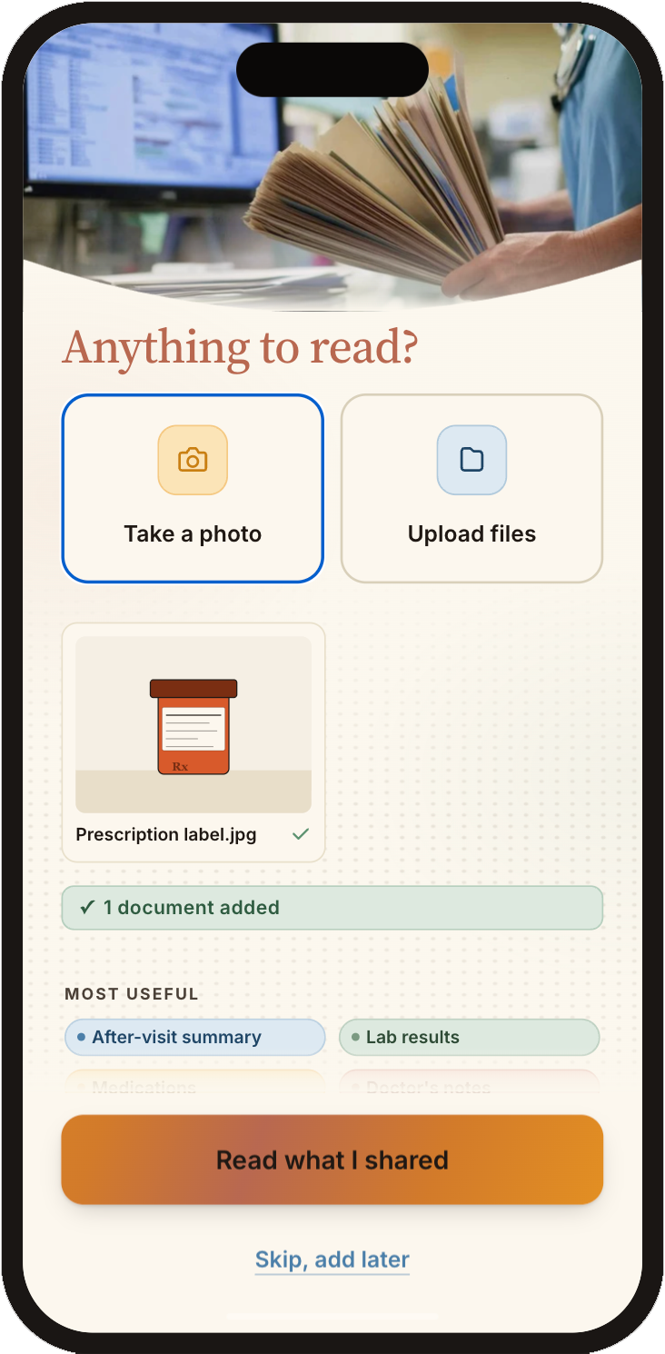
Snap a photo of the diagnosis, upload medications, charts, or describe the diagnosis in plain words. Steady reads the items, drafts questions, recommends research from reliable medical sources, creates a next-visit guide, and refuses to solve what only a clinician should. There is also an AI-driven question and answer for anything the end user wants to discuss.
The disease is medical, the cost is financial and the experience is life. Through the research findings, these were the core themes that most of the user journeys should be based around. Color was used in the visual designs to represent themes in a subtle manner.
Claude (long-context reads + synthesis) for first-person patient writing. Asked it to surface recurring patterns in the first week after a serious diagnosis: what was hardest, what got tried first, what people wished they had known.
Public-facing patient writing on Stupid Cancer, Cancer Support Community, r/cancer, and well-known survivor blogs. Published memoirs When Breath Becomes Air (Kalanithi) and Between Two Kingdoms (Jaouad).
Surfaced "the week of disorientation". Acute-phase cognition is the binding constraint. Steady cannot ask the user to learn. It has to do, then narrate.
ChatGPT to map the communication burden on the patient in the first month — what family asks for, what a patient feels obligated to provide, where the energy actually goes. Cross-checked the synthesis with Claude.
Caregiver-action network resources, CaringBridge community guidance, Family Caregiver Alliance fact sheets, and several Atlantic / NYT essays on the "telling everyone" problem after a diagnosis.
Surfaced "broadcast not 1:1" and "I don't want to be a burden". Family communication is a part-time job. Care Team has to be effortless on the patient's side or it goes unused.
Perplexity for cited oncology and navigator literature, then Claude to synthesize a one-page summary of "what clinicians wish patients walked in already asking" for any AI tool sitting alongside them.
ASCO patient-portal guidance, NEJM Catalyst pieces on AI at the bedside, JAMA op-eds on patient-facing chatbots, Memorial Sloan Kettering and Stanford navigator-program write-ups, oncology-nurse blogs (Oncology Nursing Society).
Surfaced "better questions, not answers" and the refusal contract. Steady's most valuable move is drafting the question for the next appointment, not pretending to answer it. Refusal becomes a feature, not a fallback.
Claude to walk an end-to-end map of the financial work a patient inherits at diagnosis: insurance, prior auth, FMLA, financial-aid applications. Asked it to enumerate every paperwork moment between "you have cancer" and "your appeal is filed."
CancerCare and Triage Cancer guides on financial planning, the Patient Advocate Foundation's appeals playbook, US DoL FMLA fact sheets, ACS financial-aid resources, and ProPublica's reporting on insurance denials.
Surfaced "money is the second diagnosis". The money lane in Steady doesn't track bills. It drafts the appeal, the FMLA letter, the aid application. The user reads, signs, and sends.
Perplexity to surface peer-reviewed work on chemo-brain, post-surgical fog, decision fatigue, and illness uncertainty. Then Claude to translate the academic findings into plain-language design constraints — what an attention-budget-zero user can and cannot do.
Janelsins et al. on cancer-related cognitive impairment, Mishel's Uncertainty in Illness theory, Kahneman on decision fatigue, Halpern on shared decision-making in serious illness, NIH NCI cognitive-effects review.
Cross-cuts every other track. The cognitive constraint is what makes the four other findings load-bearing. Steady has to do, then narrate. Onboarding asks five short questions and one photo; after that, the system is the active participant.
The mark is one S-curve, five rays, one horizon. The S never closes. The rays fan from a single anchor point on the curve. Stability and warmth, in two strokes.
Six tokens carry every surface, state, and lane. Reds and yellows are reserved for severity, never decoration. Each color earns its meaning.
Today.
Three things matter.
Steady's voice is one voice across every surface. Calm. Specific. First-person plural. The product tone benchmark is a calm, well-trained nurse navigator who happens to be on the phone whenever you need them.
No celebrations. No streaks. No badges. No emoji. No exclamation points. No gamification. The voice never performs.
Appointments, clinical decisions, diagnoses, clinical questions, source-citation moments. Medical blue is the only color that sources from primary documents — when you see it, the line you're reading came out of your records.
Bills, insurance, financial aid, pre-authorizations, appeals, financial-aid found tags, “Sent” confirmations. Money green never tracks debt — it confirms a move was made.
Daily life logistics, family communication, work and FMLA, emotional support, daily rhythm. Life is honey because it is the warmth — the part of the week that wants to be a week.
Anticipatory ranking of 1–3 cards across Medical / Money / Life lanes. AI selects what's worth surfacing today based on time, deadline pressure, and user context. Never more than three cards. Always source-attributed and dismissable.
Like a calm, well-trained nurse who fits in your phone and shows up exactly when something needs your attention.
I'd love to hear about your next project, your company, and the mission behind it.